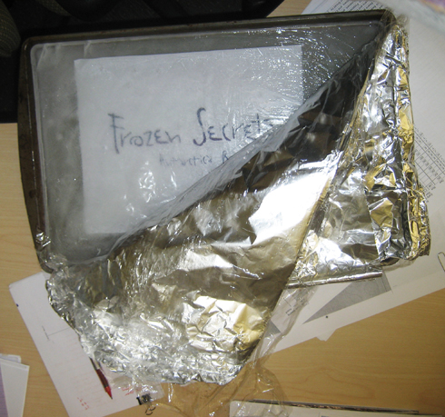
For this book about Antarctica, I wanted to freeze the title in a chunk of ice, photograph it, and use that for the cover. Here’s a part of that process:
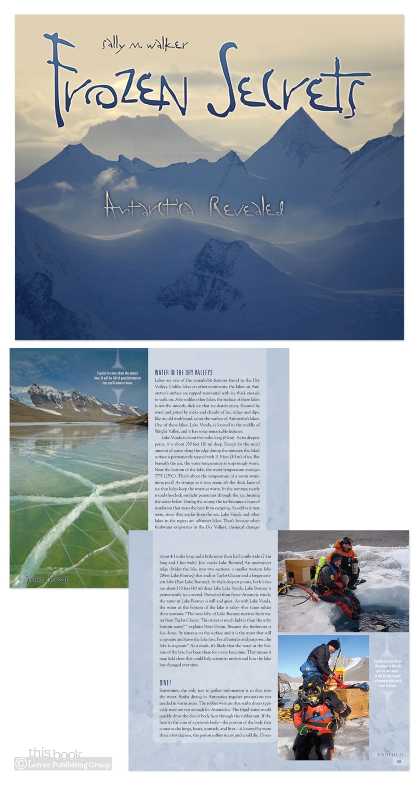
As it turns out, I have yet to learn the fine art of freezing words on paper in a chunk of ice and still making them legible enough for a children’s book cover (without using the Helvetica Neue Black which would have gotten the ‘too institutional’ comment during cover meetings). The cover version using this chunk of ice was not approved, but the the type choice was. Here’s the final cover and a spread:
There’s still ice coverage on every page, but the stock photo variety of ice—not ice from my freezer ice.


