The Art Director’s Desk

graphic design blog

In case you’ve ever wondered if a creative sort’s desk is cluttered or hyper-organized, here’s the answer. At least, here’s an answer to what one person’s work desk looks like. (Or really, it’s more like about 1/3 of my desk space.) . Take a look—it’s detailed over at the Lerner blog.

And I believe anyone with multiple piles of things on their desk will tell you that IS hyper-organization. It’s just organized in piles.

art-director-desk

Sachiko: a book journey

graphic design blog

We new this was going to be an important book from the beginning, from the moments the acquiring editors first took a look at the manuscript submission. As the development timeline of a book can be quite a long, it was months after the acquisition that I as Art Director/Designer got my first real look at the manuscript. Editor Carol (@carolchinz) was having lunch with the author at the start of the editing process, and had invited me along to be a part of the discussion, a part of the book. My first words to Caren (other than “such a pleasure to meet you”) were “I’m so glad this side of the story is being told.”

Sachiko: A Nagasaki Bomb Survivor’s Story is a book on just that. Sachiko Yasui was 6 years old when the atomic bomb was dropped on Nagasaki. This story, so elegantly, carefully, caringly written by Caren chronicles Sachiko’s life from just before the bomb blast when her family was struggling with poverty already, to her life after everything she knew was destroyed, her country was reeling, resources were at a minimum, and so many of her family members were dead.

This book is not written to argue the point of the atomic bombs. Were many many lives saved around the world because these bombs were dropped, bringing WWII finally to an end? How long would the war have lasted, how many more lives ruined if it had continued? None of us can know the answers to these questions. This book was written to describe the effects of the atomic bombs on humans, to chronicle Sachiko’s path to peace after, through a battle against cancer, to becoming a peace advocate and speaker later in life. This book is written to spread understanding and peace.

So…yeah, I had some big shoes to fill here with the design.

In that first meeting with Caren we talked about symbols, recurring themes, how the book started, and Japanese aesthetic as we understand it. What parts of this to bring into the book design, what to leave out, what the most important part of the book is, the overall feeling a reader should have when diving in, what sorts of images we will have. Very few family images survived from the time of the bombing, and very few images were taken after the bombing as there weren’t many cameras or money to acquire new cameras in the aftermath.

This conversation led me to knowing the design had to be clean, simple, respectful, weighty, laid out in a manner as to be easy to read, while avoiding cliche and stereotype. Gobs of color weren’t needed. What we needed was to bring as much focus to the emotion of the images did have. So the minimal color palette was essential—calming, warm, inviting, with the occasional touch of orange to grab attention and bring us back to the stroke of destruction, fear, and anger that is the reason for the story.

And of course the interior had to complement the cover design:

DSC_6410.150

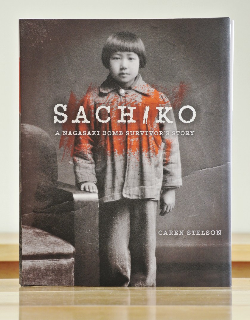
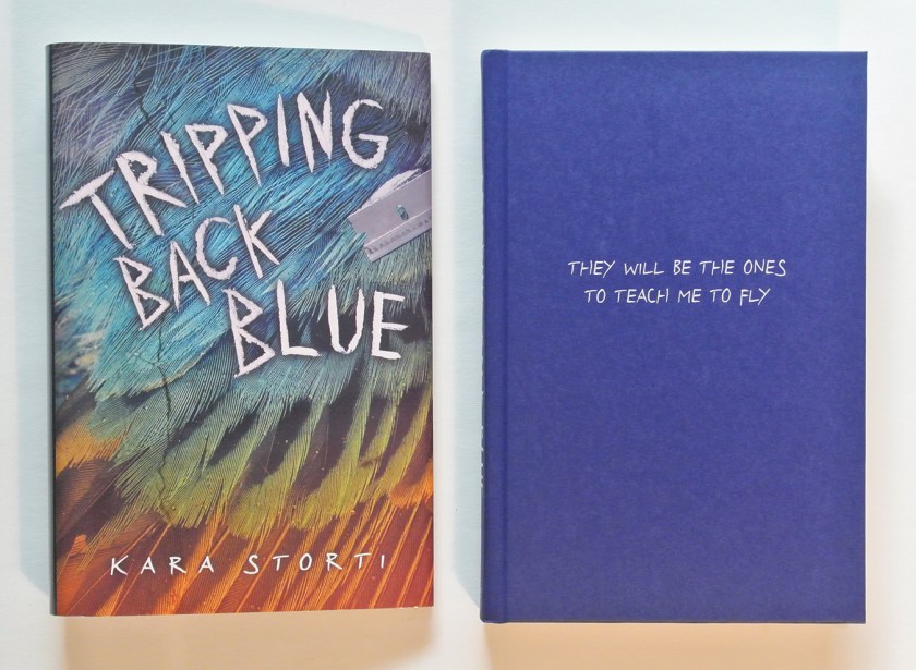
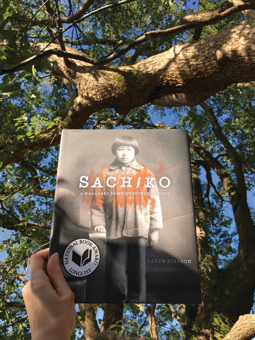
We had to look into Sachiko’s eyes on the cover to immediately draw in the reader, which meant we needed a portrait, which meant we had three surviving images to choose from. This image was taken after the war, after she had survived radiation sickness and her hair had grown back. The orange swash was added to represent the violence of the bomb that ripped apart lives. (And also as a less emotional utilitarian aspect, it helped even out the background color so the white title was easier to get to be legible without heavier photoshop effects. Yes, we deal with both the emotional and utilitarian in design. It’s not all concept & emotion.) The crease in the photo is normally something we would clone out to keep the front smooth, but in this case it gave a hint to the struggle of the story, so it was necessary to leave.

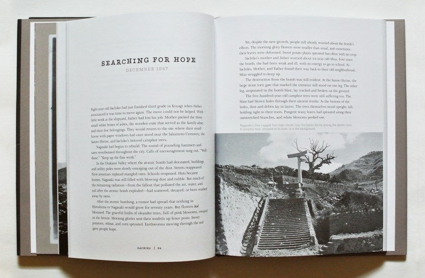
The orange became my highlight color throughout, from the striking orange page 1 to start the book to the little divider on the folios of each page. The recurring tree on select pages shows protection, resilience, growth, and family. Here are a few spreads from the inside:

DSC_6582.150DSC_6583.150

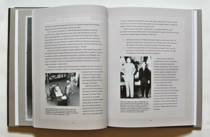
Interspersed throughout Sachiko’s narrative, as a nonfiction educational publisher we needed to include historical information. As Americans we’re quite aware of the European side of the war, less so about what was happening in the Pacific, in Japan. The information had to be accessible but not distracting to the narrative, so in the design I ended the chapters, where there was already a pause in the story, with a full-spread sidebar of historical information pertinent to that chapter. The sidebars are on warm gray pages to separate them from the white pages of Sachiko’s voice.

DSC_6585.150DSC_6586.150

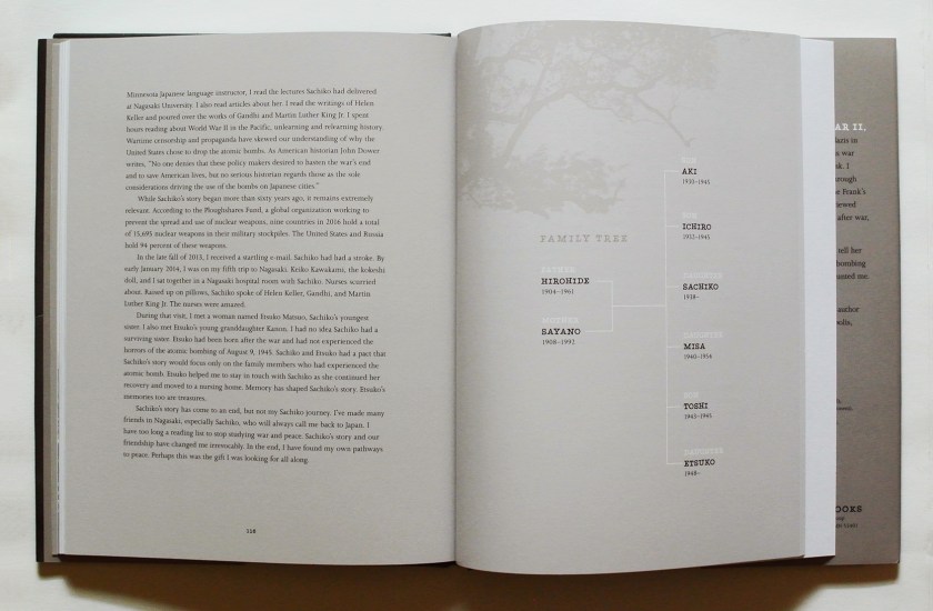
The tree motif was inspired from a pair of camphor trees in Nagasaki that somehow survived the blast amidst otherwise total destruction in the area, and are alive and thriving today. These trees I saw myself on a trip to Nagasaki earlier this year, when a group of us went to meet Sachiko in person, and I stood in awe. As author Caren said on this trip (the editor Carol and I made this journey with her, along with a small group people who had been vital to bringing this book to reality) we brought Sachiko’s voice back to Sachiko, who had lost much of her ability to speak due to a stroke a few years ago. And here she is, sheltered by the camphor trees once again, speaking this time in print to help bring peace to our world:

Sachiko_Camphor

I was lucky to be a part of this book journey and community.

Traveling back to book design

graphic design blog

Time to take a vacation from the travel posts for a bit (Yes, I was stuck on Hawaii for a while.) (And still may be.) to trek back into my world of book design. Here are a couple of posts I’ve done on the Lerner blog in fairly recent past, so journey on over there for a few why don’t you:

One, posted in April, regarding the cover design for Kara Storti’s Tripping Back Blue:

TBBjacketandHCcrop

Two, posted on leap day, regarding what happens when picture book art arrives at the office. In this case focusing on Floyd Cooper’s art for A Spy Called James. Running and sharp blades take part:

ArtCloseupCrop

And I’ve got this great idea for another post if I can just get those words out of my head into complete coherent sentences on paper.  (Amidst dreaming of new travel destinations.)

(cover image © Lerner Publishing Group, James artwork © Floyd Cooper)

Travel, Design, Tidying

graphic design blog, musings, travel blog & musings

These three things are all related right now, in my world.

I’m off of work for 10 days. And, I’m at home. That’s right, 10 days at home not traveling. And being a publishing professional I thought it would be a great time to read some books! A couple of YA titles, a couple of adult (but not THAT kind of adult) titles. The Hired Girl, done. Oblivion, started. The Best American Travel Writing 2015 and The Family Romanov are up next. But right now I’m focused on the life-changing magic of tidying up.

This book makes me want to get rid of half of my belongings and find joy everywhere! It’s that easy! I’ll get rid of everything if it brings joy! Just leave my Icelandic wool sweater because I love it so, and my old cat for the same reason, and I’ll be happy. And so uncluttered I can spin around my tiny apartment and not bump into anything, while recognizing clearly the source of everything and the fix for everything everywhere, on account of lack of clutter in the way, physically and mentally. This is how it will work right?

Nope. I mean,  I started with clearing my closets and drawers to purge unnecessary clothing, and discovered that I can’t just get rid of all of those Hard Rock t-shirts so diligently collected during travels in the ’90s, can I? There’s even one from the original in London, bought during a trip that took place at the height of mad cow disease in the UK. And, that t-shirt from New York Bagels in Budapest? Nope. No matter how yellow that white shirt is now, how can I get rid of it? After a fraught few hours of indecision, I came to a solution: put the shirts back in their underbed plastic boxes until the Mementos category. To sort them then. The rest of my wardrobe was easy to get through after that-a good third of what used to be in my closet is ready to go to the closest Goodwill.

I’m now about 10 pages away from the Mementos category. I just have to finish going through accessories and stuff in bathroom first. Avoidance, you say? Nah…

Which brings me to the main point: stuff in bathroom. Turns out there are bits from my travels everywhere in my apartment. In the bathroom there are little seashells from various places, a cheap plastic ‘snow globe’ of sorts from Capri in 1996 that has just the tiniest bit of liquid left in the bottom. That I have to keep till it’s dry. And also, in my medicine cabinet, was this:

DSC_6286alteredsmaller

(Now on my desk instead of in the medicine cabinet. And that mug you see in the background, that’s from a Viennese Christmas market from probably the same Europe trip.)

I don’t even remember when this jaunt to Europe was, it’s been in my medicine cabinet(s) for that long. The product is a serum made with witch hazel to help clear your complexion. I didn’t find it particularly helpful at the time, and STILL kept the bottle in its box in my medicine cabinet (s) for years. Every day when I open the cabinet to get my deodorant, I saw this box as well. Why have I kept this, you wonder? As far as I can discern, two reasons:

One, for the memory of being in Florence and the experience of the place. Being able to tell we were close to the farmacia just by the perfume in the air wafting down the street. Of walking into the beautifully appointed Farmaceutica di Santa Maria Novella building that has been around for hundreds of years, listening to the sales person in delightfully heavily accented English explain products. I imagined she had the description of everything in the building memorized in English, by sound, but didn’t actually know what the words all meant. She would finish a description and then look at me, nodding, helpful.

Two, for the packaging. The design of it. Not groundbreaking, but just feels like Florence. Like Italy. Like a company that has been around for 400 to 800 years and knows who they are, where they are, what they represent. The gold foil, the emboss, the prominence of the seal that technically is their logo but has so much more prominence with the weight of history. And the paper—if only you could feel the paper!

So yes, I’ve kept this for years. And now thanks to KonMari and ten days at home to devote to decluttering, I know this is one thing that could go. The serum itself no longer is useful. I decided this afternoon taking a picture and posting here as a form of archive, to revisit as many times as long as this blog is up, will make the object easy to let go of. Will it be enough though—if the joy of this pieces is in the handling, the interaction with the physical product, will I get rid of the actual thing now that it lives here digitally? Or will it find a new life on my little desk shelf next to my Hagia Sophia snow globe and Hawaiian coral.

If just an old box of fancy pimple cream is this hard for me to get rid of, wait till I get to my piles of books and press sheets of covers I’ve designed through the years. And the rest of my travel mementos that aren’t now disappeared chocolate or pictures yet to be printed. And oh, my CD’s. How I love actual printed liner notes…

a fun little design side project

graphic design blog

Two friends of mine decided to get married last year. As a present to them, I designed their wedding invitations. Marie & Andrew wanted a clean contemporary feel that wouldn’t scare off the traditionalists, and I wanted to incorporate an element specific to their ceremony location—Como Conservatory—into the invitation design. The sunken garden is a superb place to get married if you want to avoid decorating for your ceremony:
IMG_0531

None of us wanted to put a bunch of flowers on the invitation, but the swirl in the railing would do nicely. The finished invitations:
DSC_5232sm

With two invitiations and RSVP cards to put together, there were five pieces in all:

M&Asuite

Marie & Andrew are currently living happily ever and I will always think of their names combined by an ampersand. Because what designer doesn’t love the curves & shapes of an ampersand?

book design, written elsewhere

graphic design blog

Occasionally, I also write bits for the Lerner Publishing Group blog on book publishing or book design. Instead of Istanbul part 5 this week (I’ll get there soon…), I shall now give you links to a couple of my recent Lerner posts:

1) regarding arbitrarily organizing cover imagery for our next season of books

2) regarding auditions of flooring for the cover of Perfectly Good White Boy

Also, because I have a new camera lens to try out, because I’m having giddy vacation feelings before leaving for a short road trip tomorrow, and because I can, I shall also now give you a picture of my cat + sunshine + books:

MishaAndBooksSmall

proving itself

graphic design blog, musings

Does design have something to prove?

Sure. Design proves an idea. Design proves its worth by both enhancing the idea and staying out of the way at the same time. Design proves itself. Silently.

Think about it: are you more apt to notice something that is hard to read or bizarrely out of place, or something that is well thought out, not confusing to read, and flows correctly. It’s the former, of course. You’re more apt to notice the thing that doesn’t work because it impedes your understanding.

If something—anything—is properly designed, that allows the purpose behind the idea to shine through. Like an interstate system that allows for smooth flow of traffic during rush hour or your favorite vegetable peeler you can use without your hand cramping up, you use it because it works. You use it without thinking about WHY it works. It just does. Same goes for book design— you can read a book and enjoy it because it is well done and legible without thinking about WHY it is legible. And that proves the worth of design.

So it’s a bit of a double edged sword, really. To do a good design job, what you do shouldn’t really be noticed. You see the personality of the work, not the personality of the designer who helped shape it from the initial idea. (Also, while this is about design, I’d be remiss to mention that same goes for good editing—necessary, and invisible if done well.)

When you get to work with artists like Floyd Cooper on gorgeous picture books about baseball (Something To Prove by Robert Skead, published by Carolrhoda Books, 2013), what the reader should notice is the story and how well the art & words complement each other to tell the story. On this project my job as designer and art director was to help guide the artist to the proper feel, content, and composition while leaving room for text on the page—not to add a bunch of self-serving design elements that distract from the story. Anything added needs to match the feel and the idea. Which is why the main text in the book is simple & legible, and the display type resembles old baseball game posters—to enhance the story & the experience, help the reader travel into the time & place.

STP

( And also, the title type resembles old baseball posters because it was fun to break out the 100-year-old stamp sets and spend some time at work with inkpads and paper instead of on the computer.)

STPspreads

a new literary diet plan

graphic design blog, musings

Want to lose your appetite? May I suggest reading about guinea worms before lunch. Here’s a book that can help you:

9780761386339fc

(I can take no credit for the cover design, that was done by my talented friend and colleague Amelia, but I did take her splotchy cover design and adapt it to the interior layout. Here are a few spreads:)

Zombiespreads

I’m in no way saying this is a healthy diet plan, just that it helps you lose your appetite.

The guinea worm. A parasite. Say you’re really thirsty and live in a place where your water is not filtered nor treated. You drink water from streams or lakes, and little do you know that you’re drinking guinea worm larva too. The larva you drink works its way through your digestive system, somehow making its way into your leg. Over the course of about a year, it grows, maybe even up to 3 feet long. One day the worm realizes it needs to escape the host body (yours) into water to propagate, so it starts to force a way out of your skin, causing horrible sores that are calmed by being in the cooling properties of water. This makes you head to water. The worm then escapes your body and completes its life cycle by creating more larvae to infect other hosts.

Sometimes I’m just really glad I live in a town with clean and treated water.

The guinea worm is only one sort of critter that can cause zombie-like behavior in living (or dead or soon to be dead) creatures. This is an excellent read, but caution you against reading it before a meal. Unless you’re trying to not eat that meal.

And here’s a bit of a behind the scenes extra in the life of a publishing house—designer notes on a 1st pages proof of Zombie Makers:

zombiebonus

(can’t tell you that children’s book publishing biz isn’t sometimes fun)

sin-eater

graphic design blog

Here’s a book I’m proud to have been a part of. It tells of narrow-minded people and hate crimes thereof, intermixed with teenage questioning. And photography. This book—the confession—is written in the form of letters home from a young soldier before he leaves for a dangerous mission in Afghanistan. Which he volunteered for post-high school as to way to atone for, or forget, a hate crime he witnessed in small-town America. Whether or not he sends all of the letters is… well, I can’t give that away. I can say the cover design is born of that idea: the whole book sealed in an envelope, with postage not (or not yet) cancelled.

SINeater