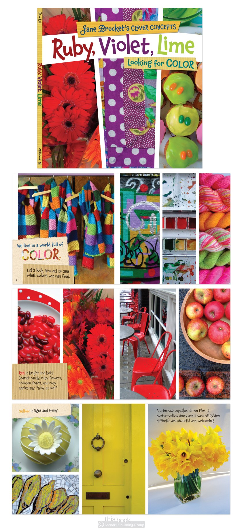
I hadn’t seen Jane Brocket’s photographs or books or followed her blog before I started working on this project. Carol, the delightful editorial director of one of our imprints, had admired Jane’s work for a while so pitched a children’s book project to her. The result was Jane Brocket’s Clever Concepts. Concepts, because this type of book—very young aged, about things such as shapes, colors, etc- are called concept books in the industry.
There are a LOT of these types of books out there. But Jane’s stand out because of the photography. She only uses natural light and photographs everyday things, so her photos have a very soft, familiar, comfortable feel that lends well to books for young children. They’re not your typical children book photos or bright rubber balls and plastic yellow duckies, but I would argue these are better. More room for thought, imagination, discovery. And, you can always live nutritionally vicariously through her photographs of delightful baked goodies.
The design process for these books started with very simple type and photos only, balanced pages and even ratios—my initial reaction to what the layouts needed to be. Then went to more overlapping, tilted, paper bits added, ‘fun’. And then it went back to the original. Almost. Some paper bits were left in, I don’t mind them. In the first book of this series, Textures, the paper only adds to the theme. And in following books (like Colors, shown below) the paper bits help to make type placement more flexible.

