Traveling back to book design

graphic design blog

Time to take a vacation from the travel posts for a bit (Yes, I was stuck on Hawaii for a while.) (And still may be.) to trek back into my world of book design. Here are a couple of posts I’ve done on the Lerner blog in fairly recent past, so journey on over there for a few why don’t you:

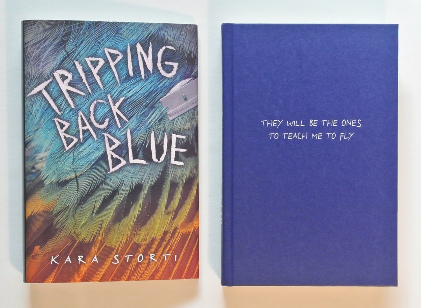
One, posted in April, regarding the cover design for Kara Storti’s Tripping Back Blue:

TBBjacketandHCcrop

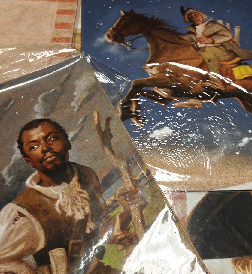
Two, posted on leap day, regarding what happens when picture book art arrives at the office. In this case focusing on Floyd Cooper’s art for A Spy Called James. Running and sharp blades take part:

ArtCloseupCrop

And I’ve got this great idea for another post if I can just get those words out of my head into complete coherent sentences on paper.  (Amidst dreaming of new travel destinations.)

(cover image © Lerner Publishing Group, James artwork © Floyd Cooper)

book design, written elsewhere

graphic design blog

Occasionally, I also write bits for the Lerner Publishing Group blog on book publishing or book design. Instead of Istanbul part 5 this week (I’ll get there soon…), I shall now give you links to a couple of my recent Lerner posts:

1) regarding arbitrarily organizing cover imagery for our next season of books

2) regarding auditions of flooring for the cover of Perfectly Good White Boy

Also, because I have a new camera lens to try out, because I’m having giddy vacation feelings before leaving for a short road trip tomorrow, and because I can, I shall also now give you a picture of my cat + sunshine + books:

MishaAndBooksSmall

proving itself

graphic design blog, musings

Does design have something to prove?

Sure. Design proves an idea. Design proves its worth by both enhancing the idea and staying out of the way at the same time. Design proves itself. Silently.

Think about it: are you more apt to notice something that is hard to read or bizarrely out of place, or something that is well thought out, not confusing to read, and flows correctly. It’s the former, of course. You’re more apt to notice the thing that doesn’t work because it impedes your understanding.

If something—anything—is properly designed, that allows the purpose behind the idea to shine through. Like an interstate system that allows for smooth flow of traffic during rush hour or your favorite vegetable peeler you can use without your hand cramping up, you use it because it works. You use it without thinking about WHY it works. It just does. Same goes for book design— you can read a book and enjoy it because it is well done and legible without thinking about WHY it is legible. And that proves the worth of design.

So it’s a bit of a double edged sword, really. To do a good design job, what you do shouldn’t really be noticed. You see the personality of the work, not the personality of the designer who helped shape it from the initial idea. (Also, while this is about design, I’d be remiss to mention that same goes for good editing—necessary, and invisible if done well.)

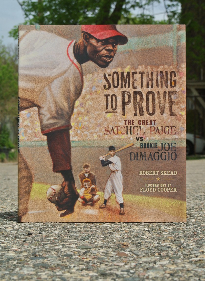
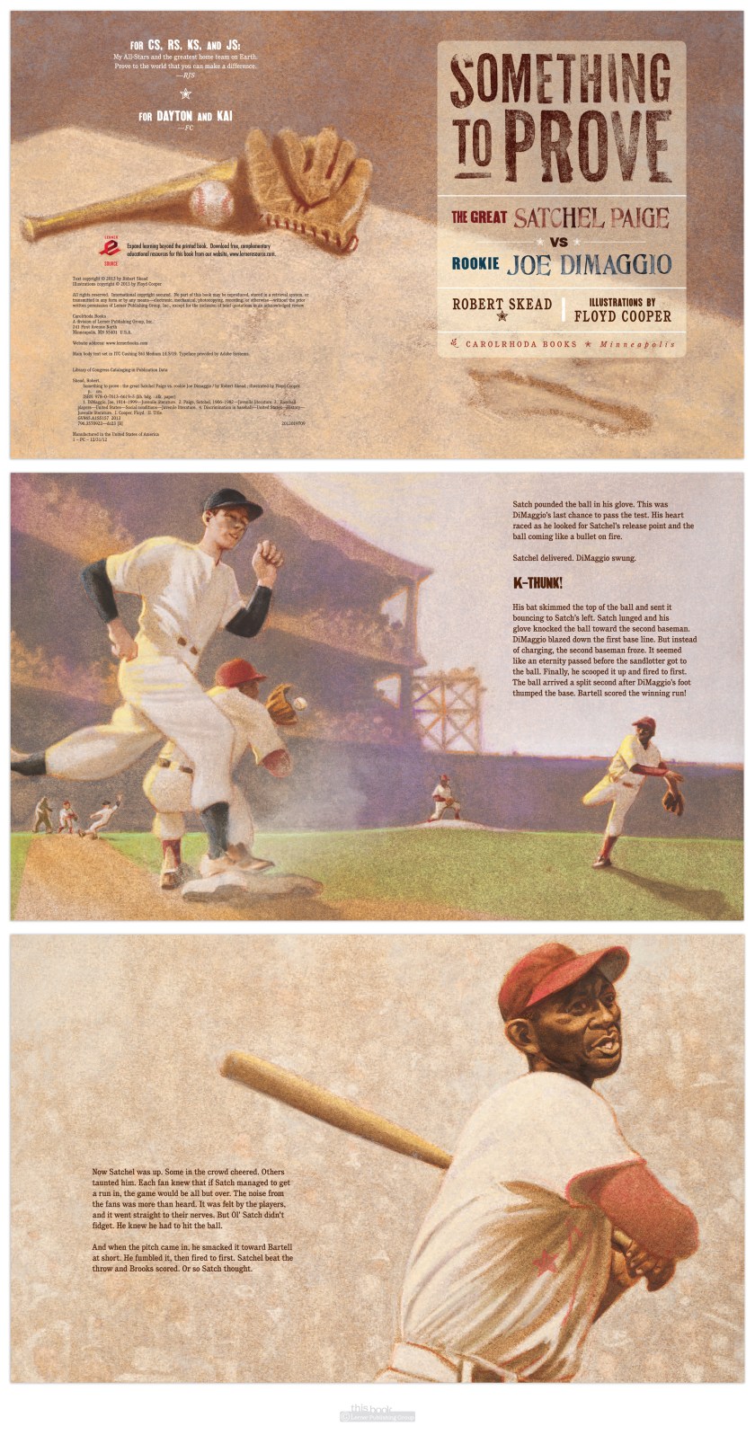
When you get to work with artists like Floyd Cooper on gorgeous picture books about baseball (Something To Prove by Robert Skead, published by Carolrhoda Books, 2013), what the reader should notice is the story and how well the art & words complement each other to tell the story. On this project my job as designer and art director was to help guide the artist to the proper feel, content, and composition while leaving room for text on the page—not to add a bunch of self-serving design elements that distract from the story. Anything added needs to match the feel and the idea. Which is why the main text in the book is simple & legible, and the display type resembles old baseball game posters—to enhance the story & the experience, help the reader travel into the time & place.
STP

( And also, the title type resembles old baseball posters because it was fun to break out the 100-year-old stamp sets and spend some time at work with inkpads and paper instead of on the computer.)
STPspreads

a new literary diet plan

graphic design blog, musings

Want to lose your appetite? May I suggest reading about guinea worms before lunch. Here’s a book that can help you:

9780761386339fc

(I can take no credit for the cover design, that was done by my talented friend and colleague Amelia, but I did take her splotchy cover design and adapt it to the interior layout. Here are a few spreads:)

Zombiespreads

I’m in no way saying this is a healthy diet plan, just that it helps you lose your appetite.

The guinea worm. A parasite. Say you’re really thirsty and live in a place where your water is not filtered nor treated. You drink water from streams or lakes, and little do you know that you’re drinking guinea worm larva too. The larva you drink works its way through your digestive system, somehow making its way into your leg. Over the course of about a year, it grows, maybe even up to 3 feet long. One day the worm realizes it needs to escape the host body (yours) into water to propagate, so it starts to force a way out of your skin, causing horrible sores that are calmed by being in the cooling properties of water. This makes you head to water. The worm then escapes your body and completes its life cycle by creating more larvae to infect other hosts.

Sometimes I’m just really glad I live in a town with clean and treated water.

The guinea worm is only one sort of critter that can cause zombie-like behavior in living (or dead or soon to be dead) creatures. This is an excellent read, but caution you against reading it before a meal. Unless you’re trying to not eat that meal.

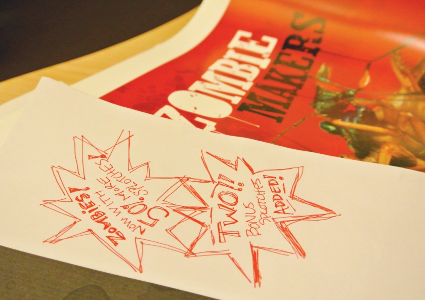
And here’s a bit of a behind the scenes extra in the life of a publishing house—designer notes on a 1st pages proof of Zombie Makers:

zombiebonus

(can’t tell you that children’s book publishing biz isn’t sometimes fun)

sin-eater

graphic design blog

Here’s a book I’m proud to have been a part of. It tells of narrow-minded people and hate crimes thereof, intermixed with teenage questioning. And photography. This book—the confession—is written in the form of letters home from a young soldier before he leaves for a dangerous mission in Afghanistan. Which he volunteered for post-high school as to way to atone for, or forget, a hate crime he witnessed in small-town America. Whether or not he sends all of the letters is… well, I can’t give that away. I can say the cover design is born of that idea: the whole book sealed in an envelope, with postage not (or not yet) cancelled.

SINeater

put a bird on it

graphic design blog

It wasn’t until we were reviewing cover options with the VPs for this high-school level nonfiction title, and a colleague leaned over to me to whisper “put a bird on it,” that I realized what I had done. I had put a bird on it, and it was even blue.

Shaking

This isn’t just any decorative bird though, this is one of Darwin’s finches—a tiny creature that helped form the theory of evolution. I was entranced by how something so small could be one of the genesis points of such a change in human thought. So this bird deserves to be on a book cover. The way the colors vibrate off each other adds the ‘shake’ and evokes the tension of the controversial theory at its inception.

from the top of the world

graphic design blog

Here’s something I’ve designed recently—Tales from the Top of the World, a book about climbing Mount Everest, focusing on the experiences of ‘Mr. Everest’ Pete Athans. Reading this book will simultaneously make you:
1. want to Climb Mount Everest
2. never ever ever want to climb Mount Everest
3. have immense respect for those who have attempted and accomplished this feat.

I kept the layout fairly simple to show off the photography, aiming for a high-quality magazine feel. And as every bit of climbing Everest has an element of danger involved, I’ve so used a thin red line motif in various places and ways throughout the book.

catch and release

graphic design blog

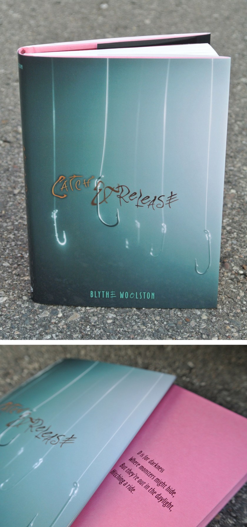
Remember back when I mentioned Blythe and this book before? Now I can show you the jacket and cover design:

There is a lack of body parts on this cover. Which does make sense, considering the story.

Blythe signed a fantastic publishing deal with a different publisher for her third & fourth books, so I won’t be designing those covers. This makes me sad, yet I am happy for Blythe. It was a pleasure to put the wrappings on her first two books, even though to do so I had to read about my number one fear: flesh-eating bacteria.

live & learn & do things you never thought you would

graphic design blog

Here’s something I never thought I would do: set an entire book in Helvetica.

(with intermittent display font Soccerboy from Minneapolis’ own Chank.)

Why not Helvetica? It’s system, which means anyone can use it, therefor it’s overused in badly or undesigned pieces. That gives it a bad rap, and for me a prejudice against. The Helvetica documentary did help redeem the typeface for me by being reminded it was careful work of a craftsman, and was new and exciting in its time. Which was the late 50’s early 60’s. Which is much of the time period of this book. So it fit the style. And I used it. And I was surprised I did. And I liked it. Live & learn.


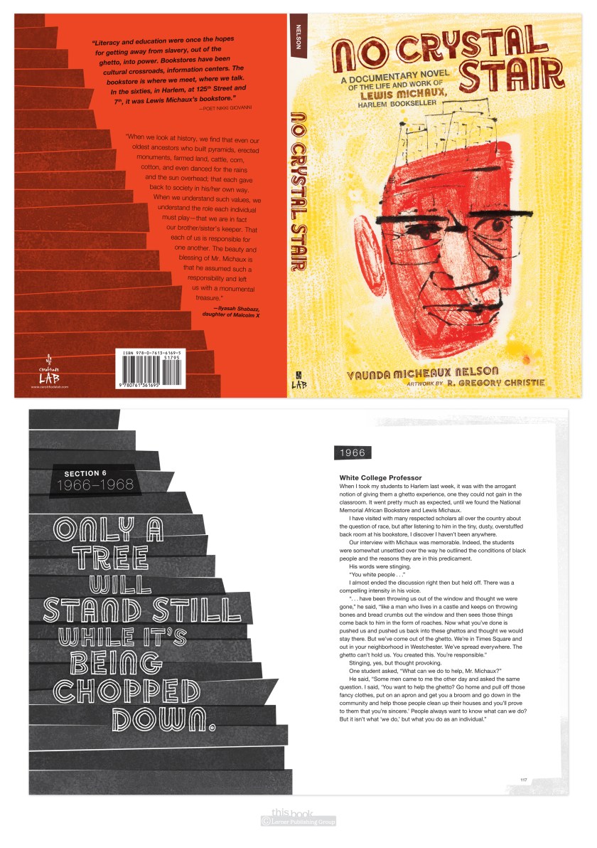
UPDATE: another thing I learned thanks to No Crystal Stair was how to use imovie to make a book trailer. Not too bad for a first attempt at this type of thing, I humbly hope.