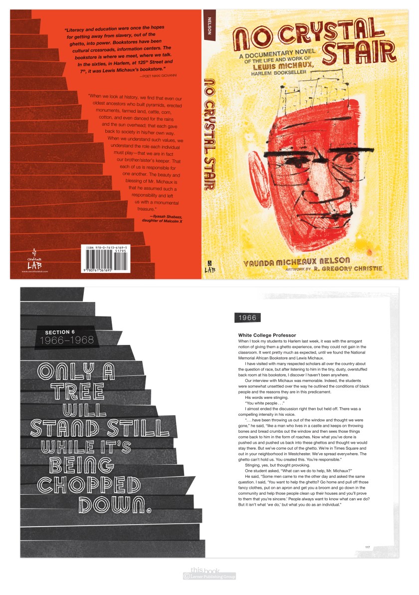
Here’s something I never thought I would do: set an entire book in Helvetica.
(with intermittent display font Soccerboy from Minneapolis’ own Chank.)
Why not Helvetica? It’s system, which means anyone can use it, therefor it’s overused in badly or undesigned pieces. That gives it a bad rap, and for me a prejudice against. The Helvetica documentary did help redeem the typeface for me by being reminded it was careful work of a craftsman, and was new and exciting in its time. Which was the late 50’s early 60’s. Which is much of the time period of this book. So it fit the style. And I used it. And I was surprised I did. And I liked it. Live & learn.
UPDATE: another thing I learned thanks to No Crystal Stair was how to use imovie to make a book trailer. Not too bad for a first attempt at this type of thing, I humbly hope.

