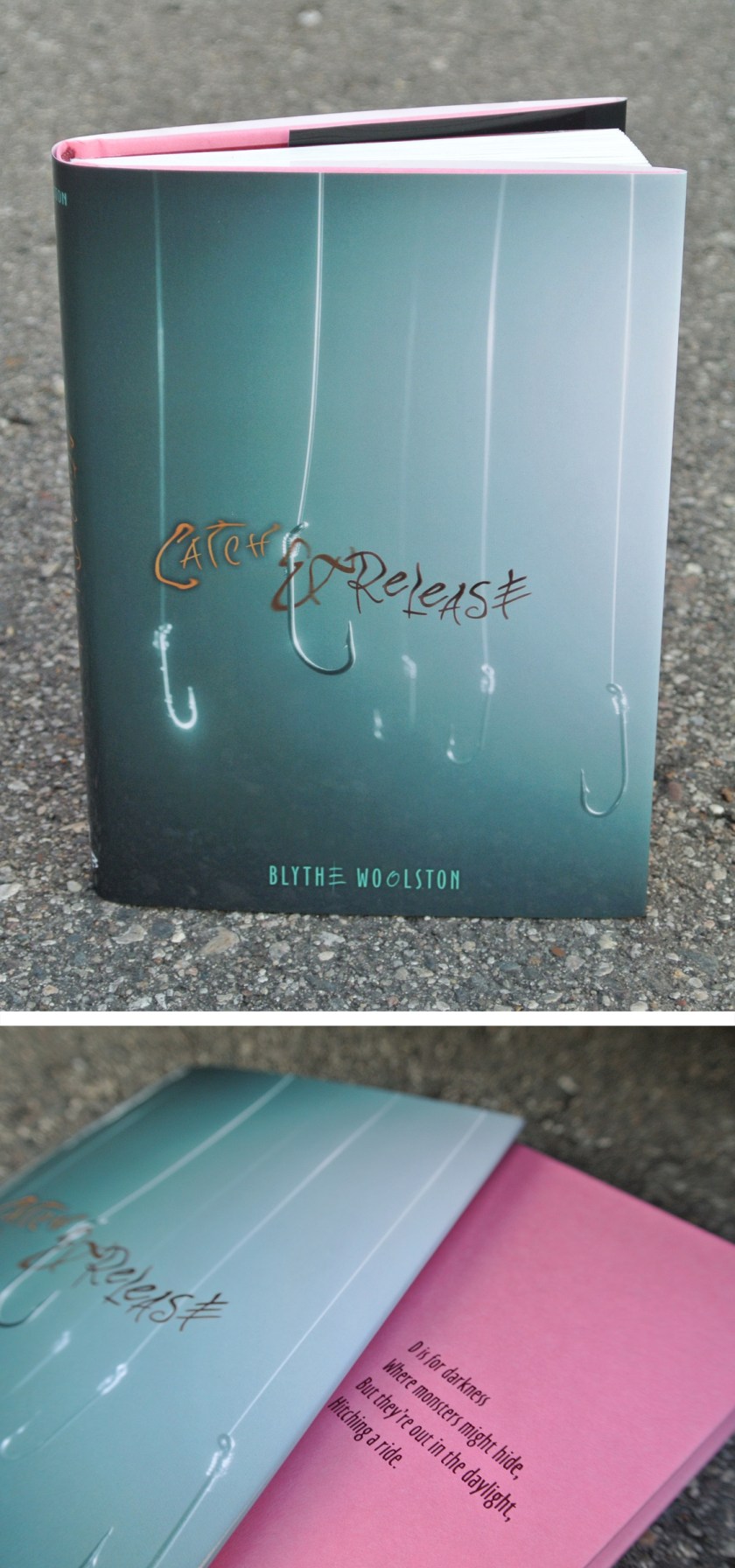
This one about foil stamps, embossing, debossing, and other things the general book reading public doesn’t know designers agonize over. Click on the pretty picture. Nothing bad will happen, I promise. (How could it go bad with words like emboss, deboss, and foil stamp? Those things are only used for good.)
Cover design
catch and release
graphic design blogRemember back when I mentioned Blythe and this book before? Now I can show you the jacket and cover design:
There is a lack of body parts on this cover. Which does make sense, considering the story.
Blythe signed a fantastic publishing deal with a different publisher for her third & fourth books, so I won’t be designing those covers. This makes me sad, yet I am happy for Blythe. It was a pleasure to put the wrappings on her first two books, even though to do so I had to read about my number one fear: flesh-eating bacteria.
live & learn & do things you never thought you would
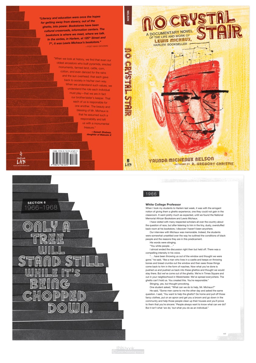
graphic design blogHere’s something I never thought I would do: set an entire book in Helvetica.
(with intermittent display font Soccerboy from Minneapolis’ own Chank.)
Why not Helvetica? It’s system, which means anyone can use it, therefor it’s overused in badly or undesigned pieces. That gives it a bad rap, and for me a prejudice against. The Helvetica documentary did help redeem the typeface for me by being reminded it was careful work of a craftsman, and was new and exciting in its time. Which was the late 50’s early 60’s. Which is much of the time period of this book. So it fit the style. And I used it. And I was surprised I did. And I liked it. Live & learn.
UPDATE: another thing I learned thanks to No Crystal Stair was how to use imovie to make a book trailer. Not too bad for a first attempt at this type of thing, I humbly hope.


