The Shoe Underworld. Ooooooooh. Click the link. See how seedy it really is.
Author: carkneetoe
and yet more alternate reading
Anonymous Lerner Shoe Bloggerspring cleaning, graphic designer style
graphic design blog, musings
The spring cleaning bug has hit me hard lately! Last week I cleaned my closets and ended up donating about 4 shopping bags worth of clothes. This week, I’ve started in on refreshing my own blog and identity pieces—they’re going to be lighter and cleaner than the previous version. See? Spring cleaning, graphic designer style. Stay tuned for that refresh, I’ll be posting it soon!
I’m also cleaning off my camera’s memory card. So I’ll leave you this evening with an outtake, which I’ve entitled ‘trial and error.’
I don’t normally title my photographs, I’ll reserve that for actual photographers, but this title stuck as it has twofold meaning.
One: I recently purchased a new camera much nicer than my old camera. It’s fun, but I’m still learning how to take night photographs. This picture was taken in Duluth last Saturday, when a couple of friends and I drove up on a whim to see the Northern Lights.
Two: The Northern Lights did not show. So, another trial and error. At least I had fun trying to capture Duluth city lights reflecting on the lake. Northern lights, of a sort.
what can’t wait
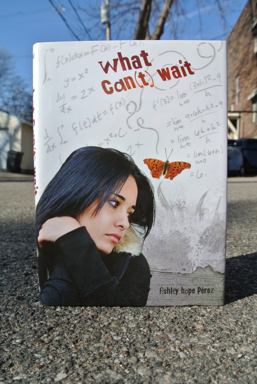
graphic design blogWhat Can’t Wait is a debut YA novel from Ashley Hope Pérez. The protagonist, Marisa, is torn between staying in Houston and her grocery store job, and pursuing a college education and career in physics. Her teachers expect her to get into college with AP classes and scholarships, but expectations from her very traditional Mexican familia are that she must stay in Houston to work and take care of her entire family after high school. The story is gripping and wonderfully written—you truly do not know until the end what path Marisa will chose. But the story was also fairly traditional, so a highly symbolic cover would have been misrepresentative of the story. Instead of going full-on esoteric, I opted for the design direction of a collage of elements evocative of all she must choose between. The girl looking somewhat distraught, the roughness of her Houston neighborhood and life, the butterfly art and her boyfriend, the physics equations, and warped title type—to echo Marisa’s stretching to try to make both goals of college and supporting her family possible. People (and type) can only stretch so far before they break (or become illegible).
and more alternate reading
Anonymous Lerner Shoe Bloggeralternate reading
Anonymous Lerner Shoe Bloggercatch and release
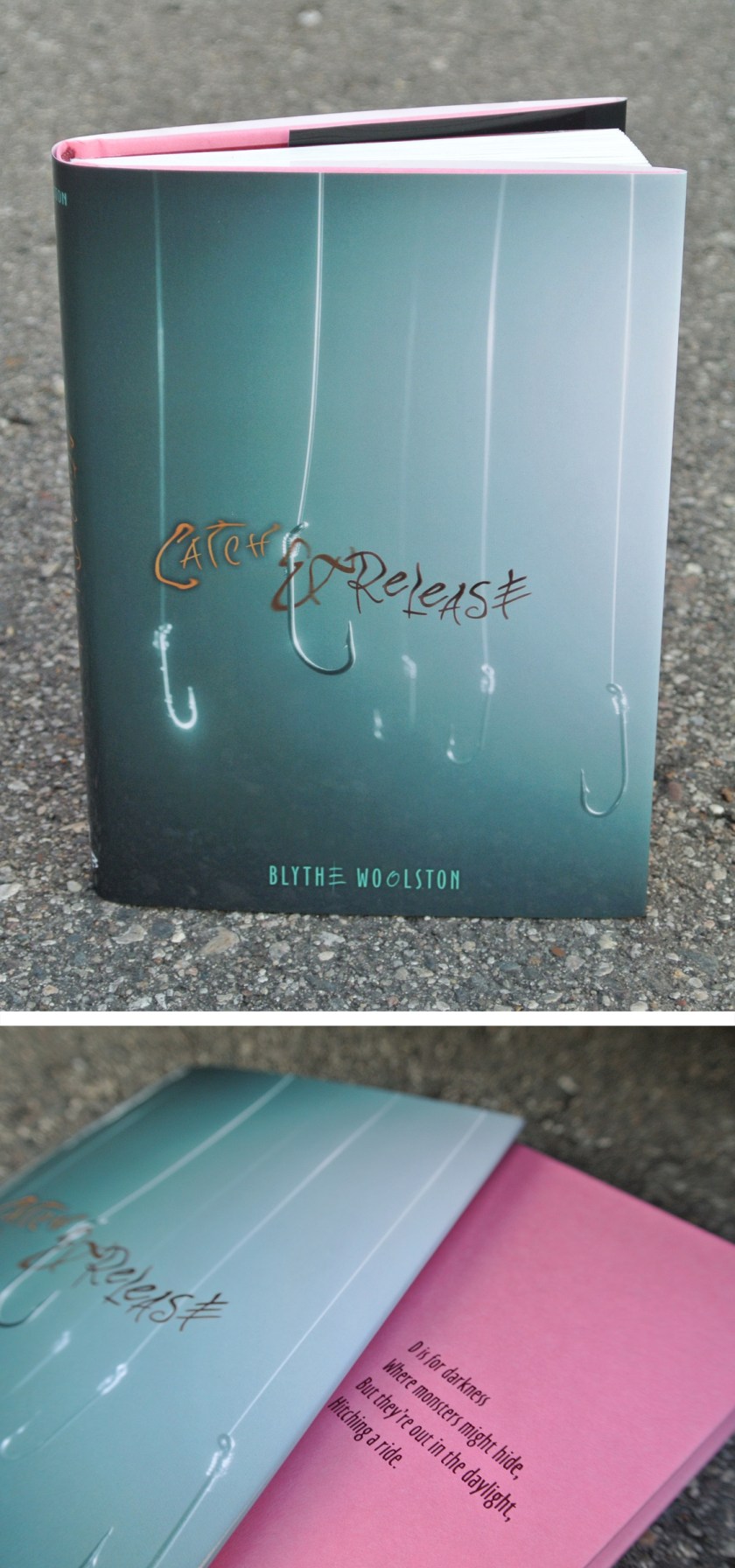
graphic design blogRemember back when I mentioned Blythe and this book before? Now I can show you the jacket and cover design:
There is a lack of body parts on this cover. Which does make sense, considering the story.
Blythe signed a fantastic publishing deal with a different publisher for her third & fourth books, so I won’t be designing those covers. This makes me sad, yet I am happy for Blythe. It was a pleasure to put the wrappings on her first two books, even though to do so I had to read about my number one fear: flesh-eating bacteria.
live & learn & do things you never thought you would
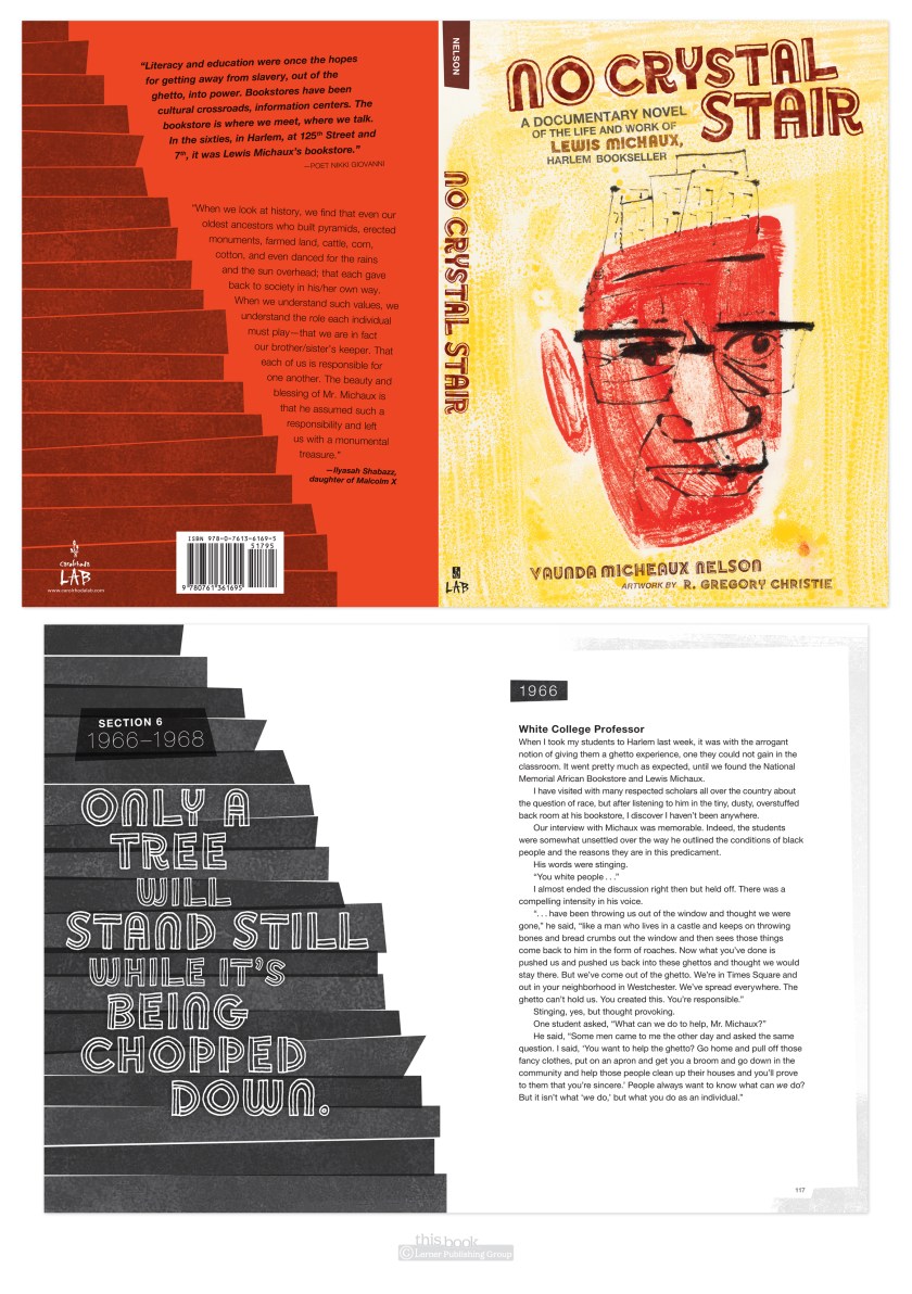
graphic design blogHere’s something I never thought I would do: set an entire book in Helvetica.
(with intermittent display font Soccerboy from Minneapolis’ own Chank.)
Why not Helvetica? It’s system, which means anyone can use it, therefor it’s overused in badly or undesigned pieces. That gives it a bad rap, and for me a prejudice against. The Helvetica documentary did help redeem the typeface for me by being reminded it was careful work of a craftsman, and was new and exciting in its time. Which was the late 50’s early 60’s. Which is much of the time period of this book. So it fit the style. And I used it. And I was surprised I did. And I liked it. Live & learn.
UPDATE: another thing I learned thanks to No Crystal Stair was how to use imovie to make a book trailer. Not too bad for a first attempt at this type of thing, I humbly hope.
it’s not YOU designers are scowling at
graphic design blog, musingsEver walk up on a working designer and see them scowling at a computer screen? Or just staring? And then wonder if that is what designers do all day—stare and scowl? It’s true, there is a lot of screen time logged in our chosen profession, but the inner workings of the creative brain are hard at work. Here are some things we’re contemplating while staring:
Those fonts just don’t work together. Scrap the display face, go with a sans instead.
Those colors together…just…no. No.
Bah! Look at the size of that face! It’s scary! Good rule of thumb: no faces larger than life sized.
This is such a nice default font to use. But I really need to stop using this font as default.
That sidebar placement completely destroys the flow of the spread.
Does this design look too…early ‘90’s grunge band-esque?
There’s a high concentration of black and yellow in this season already. Try a different color scheme.
Resist the photoshop filters. Resist the photoshop filters.
THIS ISN’T WORKING. RRRRRRRR. (usually accompanied by hair rending in some manner)
Blasted rainbow wheel of death.
*insert favorite expletive here*
The feel of this layout is too serious. It needs to be much more in keeping with the playful voice of the manuscript. How best to achieve this? (usually followed shortly by staring up & to the right. Or sketching. Or research.) (side note: looking up and to the right can also connote another form of creativity—lying)
There’s just not enough magic in these. Ask illustrator to add more magic.
Cover meeting in an hour cover meeting in an hour need to show this at cover meeting in an hour COVER MEETING IN AN HOUR
This is turning out really well! But for a teen book, not a 4th grade book. Save idea for a more fitting project.
Is this really a plausible design solution for a series of books that will go on indefinitely? Can’t be too trendy to last.
Do I REALLY want to hand letter all the chapter titles and sidebar heads and running footers and playlists and title pages and covers for every book in this series? Not really time efficient. Or xml efficient. And I’ll end up with claw hand at the end of it. But it’d be the correct way to solve the design. Yes, I shall do it, and suffer for my art!
(In case you’re new here, yes, I design books for a k-12 children’s book publisher. And may tend towards the overly dramatic at times.)
There’s always more, but for now I’ll end this brief foray into the designerly mind. What runs through your head when staring at computer screen at work?
old notes
graphic design blog, musingsI recently found some design class notes from college days gone by. Here are a few select tidbits:
When thinking about a design problem, go places. Somewhere you’ve never been, or just some place different.
Approach something as if you have never done it before.
Exaggerate—go to extremes
Create a list of words and phrases that boils the problem down to the essence of what needs to be communicated.
Visualize that brick wall you just hit.
Restate the problem in terms you can work from.
Take risks with no fear of failure.
Keep laughing!
Still relevant points. And I imagine they always will be.


