put a bird on it

graphic design blog

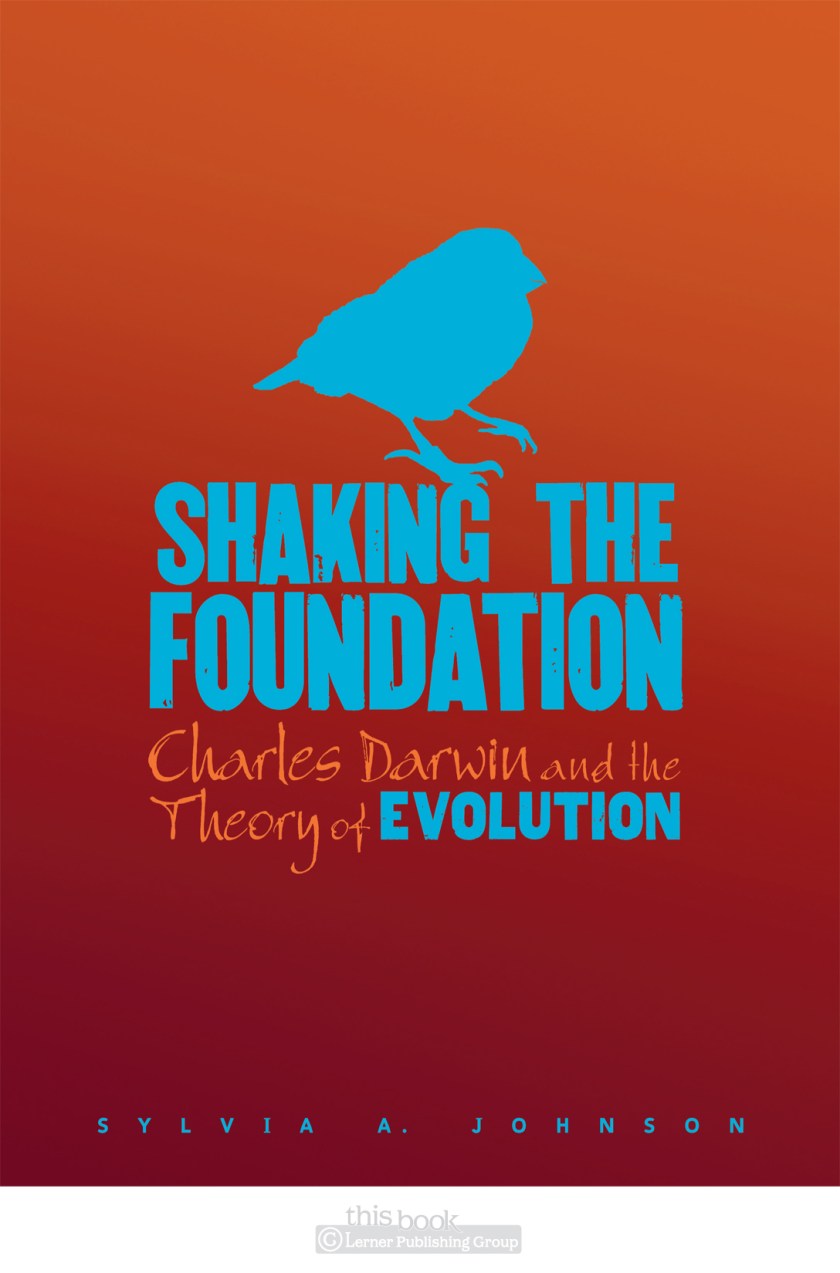
It wasn’t until we were reviewing cover options with the VPs for this high-school level nonfiction title, and a colleague leaned over to me to whisper “put a bird on it,” that I realized what I had done. I had put a bird on it, and it was even blue.

Shaking

This isn’t just any decorative bird though, this is one of Darwin’s finches—a tiny creature that helped form the theory of evolution. I was entranced by how something so small could be one of the genesis points of such a change in human thought. So this bird deserves to be on a book cover. The way the colors vibrate off each other adds the ‘shake’ and evokes the tension of the controversial theory at its inception.

old things

graphic design blog, musings

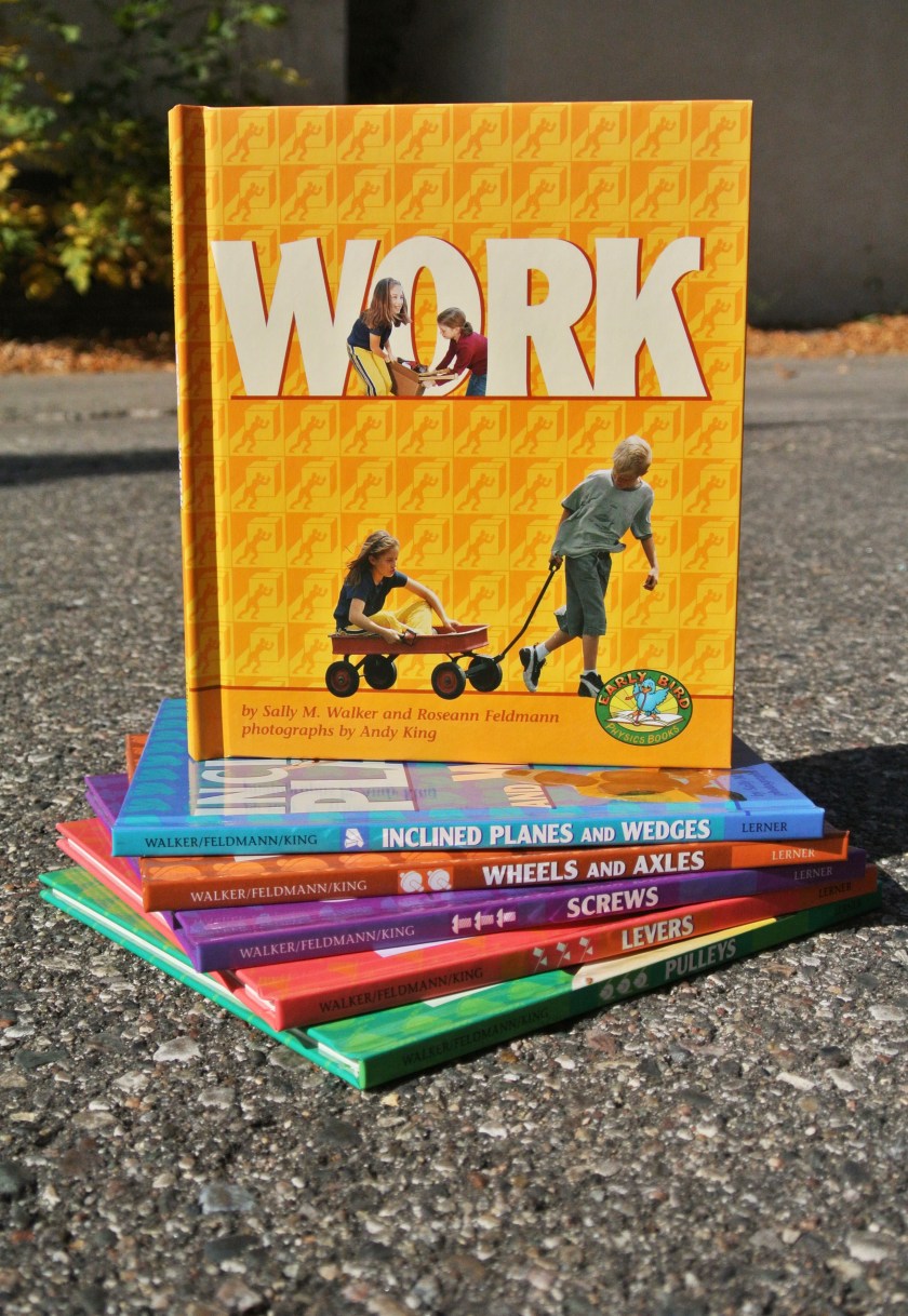
I’ve recently been working my way through the a couple of stacks of books I’ve designed, with the goal of photographing, archiving, and then donating the actual book. The stacks look like this right now, and this is probably 1/6th of the books I’ve worked on over the years:

All of these books become heavier and heavier to move it seems—and as I’ll probably be moving again in early 2013, lessening my book stacks by even a few seems like a grand idea.

There are many memories in these books. Here’s the first series I designed after starting at Lerner:

Fun thing is, I still like how these covers turned out. (The inside is a different story. This was a subset of an existing series of books—I didn’t get to fully redesign the inside. I claim no responsibility for how the inside looks. Or the logo.) This series design with bright, patterned backgrounds and multiple smaller knocked-out photos was really a departure from what the design norm was at the time in the company. I was the young new designer after all, had to make my mark. How long ago this was, I shall not admit.

Now that I look at these again and wax nostalgic, I may not be able to get rid of them after all. Phoo. Plans foiled.

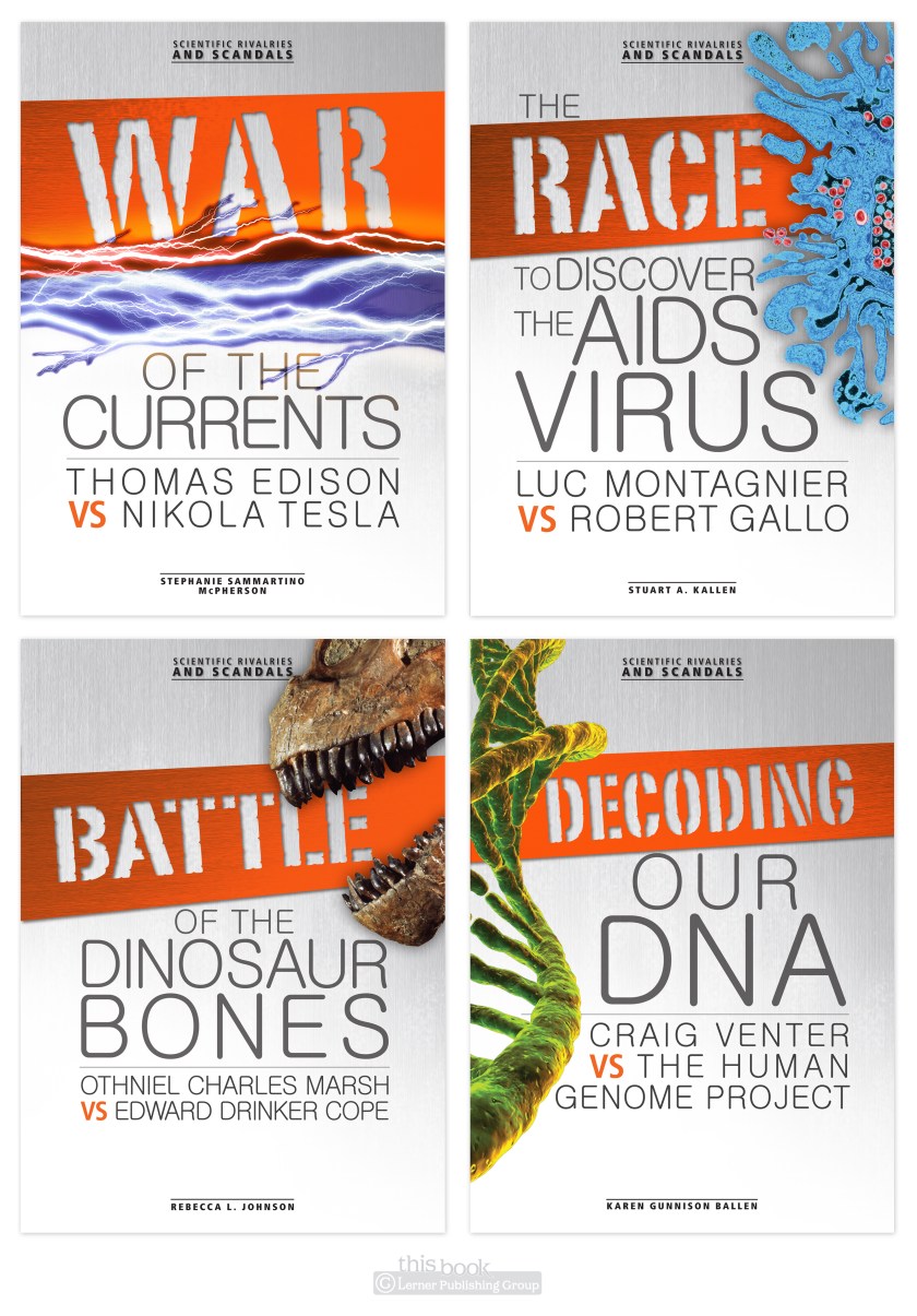
scientific rivalries: creative process

graphic design blog

Ah, the creative process. A process in which research, indecision, dislike, burnout, client decisions, deadlines, breakthroughs, and triumph all are a part. This series cover project had all of that, in spades. Multiple times. It was a trial, but in the end I’m quiet happy with the way these have turned out. These books are a look at scientific discoveries & ideas and the rivalries between scientists who furthered these ideas. Scientists aren’t always the nicest of people, nor do they always play nicely with others…

from the top of the world

graphic design blog

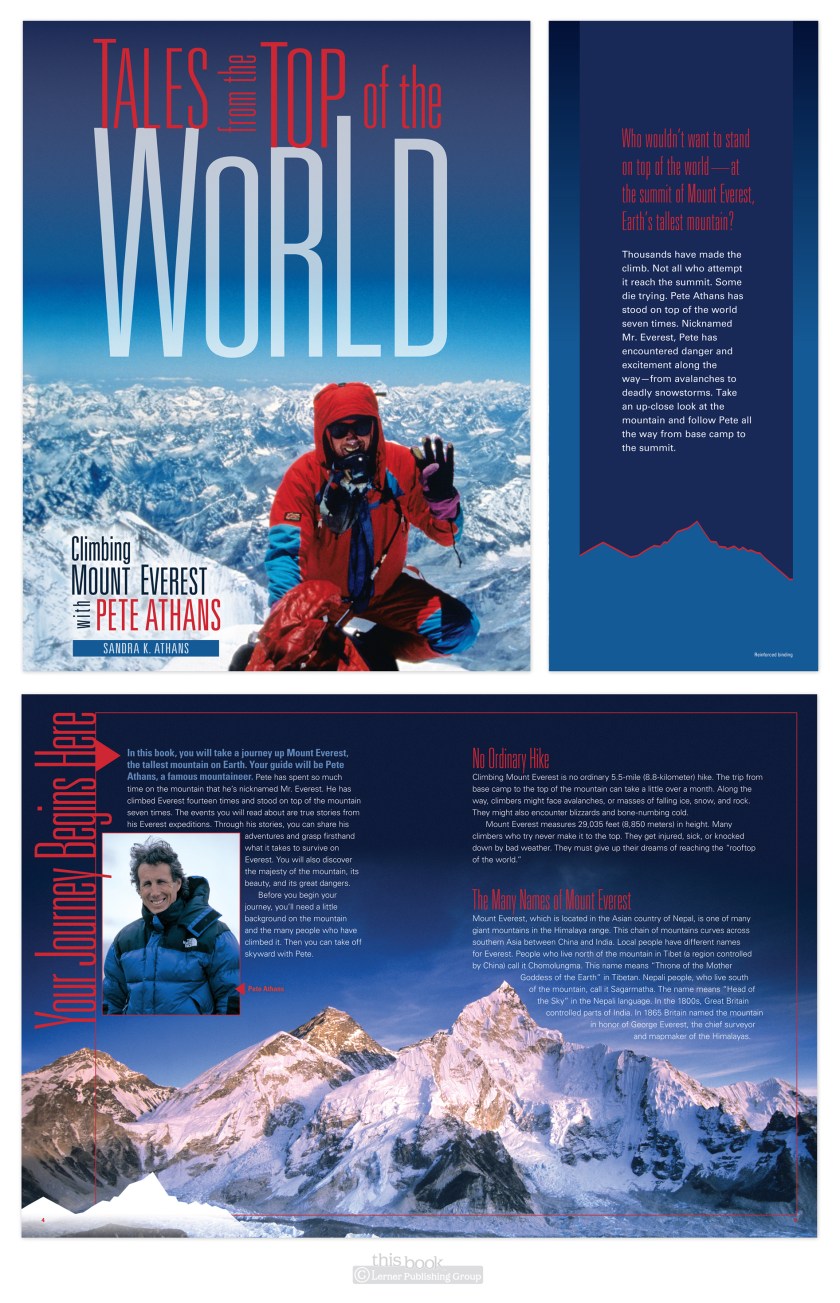
Here’s something I’ve designed recently—Tales from the Top of the World, a book about climbing Mount Everest, focusing on the experiences of ‘Mr. Everest’ Pete Athans. Reading this book will simultaneously make you:
1. want to Climb Mount Everest
2. never ever ever want to climb Mount Everest
3. have immense respect for those who have attempted and accomplished this feat.

I kept the layout fairly simple to show off the photography, aiming for a high-quality magazine feel. And as every bit of climbing Everest has an element of danger involved, I’ve so used a thin red line motif in various places and ways throughout the book.

rrrgh.

graphic design blog, musings

Hey readers. Just a note to say I WANT to post a designery thing or two I’ve done recently, but I can’t because they’re not live and/or published yet. Soon, my pretties, soon.

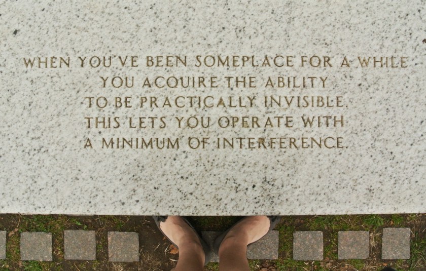
But for now, a photograph for thinking minds:


Name that artist.

HINT: I did my Contemporary Art History final paper on this artist.
Good hint, I know.

identity redux one

graphic design blog

And…here it is, new personal identity pieces. I’m much happier with the redo than with the original.


(There’s an invoice design too, just not shown here. That would have been too much white in the display. But, since this is an identity package, you can get a good idea of what it looks like based on the other pieces. Funny how that works.)

spring cleaning, graphic designer style

graphic design blog, musings


The spring cleaning bug has hit me hard lately! Last week I cleaned my closets and ended up donating about 4 shopping bags worth of clothes. This week, I’ve started in on refreshing my own blog and identity pieces—they’re going to be lighter and cleaner than the previous version. See? Spring cleaning, graphic designer style. Stay tuned for that refresh, I’ll be posting it soon!

I’m also cleaning off my camera’s memory card. So I’ll leave you this evening with an outtake, which I’ve entitled ‘trial and error.’

I don’t normally title my photographs, I’ll reserve that for actual photographers, but this title stuck as it has twofold meaning.

One: I recently purchased a new camera much nicer than my old camera. It’s fun, but I’m still learning how to take night photographs. This picture was taken in Duluth last Saturday, when a couple of friends and I drove up on a whim to see the Northern Lights.

Two: The Northern Lights did not show. So, another trial and error. At least I had fun trying to capture Duluth city lights reflecting on the lake. Northern lights, of a sort.

what can’t wait

graphic design blog

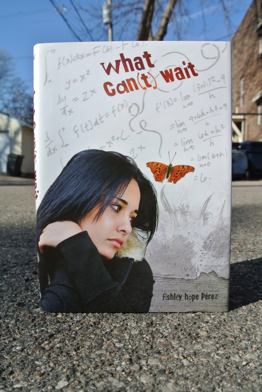
What Can’t Wait is a debut YA novel from Ashley Hope Pérez. The protagonist, Marisa, is torn between staying in Houston and her grocery store job, and pursuing a college education and career in physics. Her teachers expect her to get into college with AP classes and scholarships, but expectations from her very traditional Mexican familia are that she must stay in Houston to work and take care of her entire family after high school. The story is gripping and wonderfully written—you truly do not know until the end what path Marisa will chose. But the story was also fairly traditional, so a highly symbolic cover would have been misrepresentative of the story. Instead of going full-on esoteric, I opted for the design direction of a collage of elements evocative of all she must choose between. The girl looking somewhat distraught, the roughness of her Houston neighborhood and life, the butterfly art and her boyfriend, the physics equations, and warped title type—to echo Marisa’s stretching to try to make both goals of college and supporting her family possible. People (and type) can only stretch so far before they break (or become illegible).

catch and release

graphic design blog

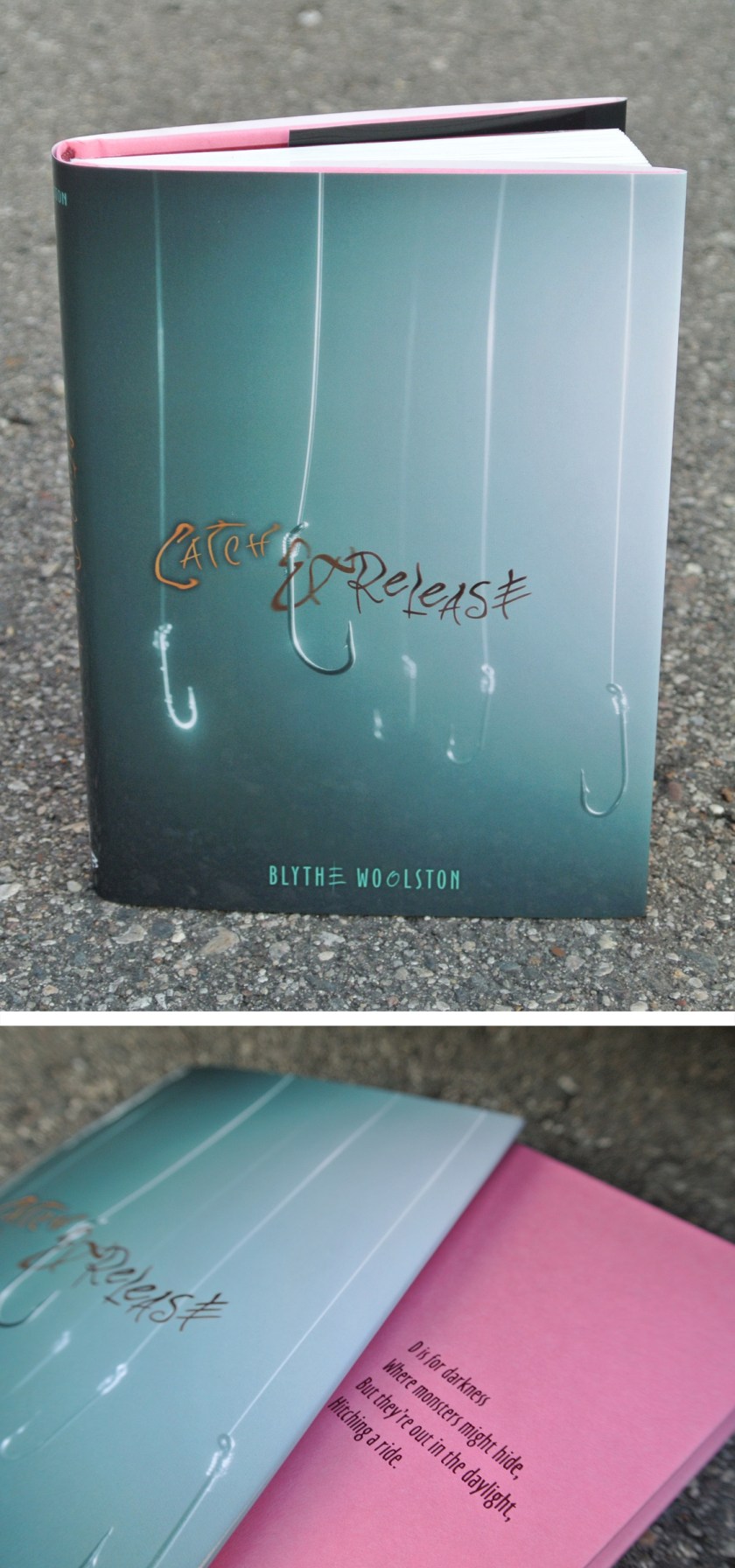
Remember back when I mentioned Blythe and this book before? Now I can show you the jacket and cover design:

There is a lack of body parts on this cover. Which does make sense, considering the story.

Blythe signed a fantastic publishing deal with a different publisher for her third & fourth books, so I won’t be designing those covers. This makes me sad, yet I am happy for Blythe. It was a pleasure to put the wrappings on her first two books, even though to do so I had to read about my number one fear: flesh-eating bacteria.

live & learn & do things you never thought you would

graphic design blog

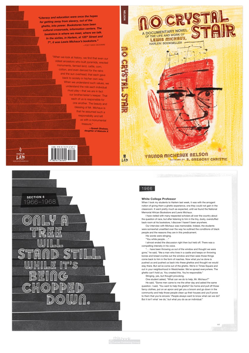
Here’s something I never thought I would do: set an entire book in Helvetica.

(with intermittent display font Soccerboy from Minneapolis’ own Chank.)

Why not Helvetica? It’s system, which means anyone can use it, therefor it’s overused in badly or undesigned pieces. That gives it a bad rap, and for me a prejudice against. The Helvetica documentary did help redeem the typeface for me by being reminded it was careful work of a craftsman, and was new and exciting in its time. Which was the late 50’s early 60’s. Which is much of the time period of this book. So it fit the style. And I used it. And I was surprised I did. And I liked it. Live & learn.


UPDATE: another thing I learned thanks to No Crystal Stair was how to use imovie to make a book trailer. Not too bad for a first attempt at this type of thing, I humbly hope.