put a bird on it

graphic design blog

It wasn’t until we were reviewing cover options with the VPs for this high-school level nonfiction title, and a colleague leaned over to me to whisper “put a bird on it,” that I realized what I had done. I had put a bird on it, and it was even blue.

Shaking

This isn’t just any decorative bird though, this is one of Darwin’s finches—a tiny creature that helped form the theory of evolution. I was entranced by how something so small could be one of the genesis points of such a change in human thought. So this bird deserves to be on a book cover. The way the colors vibrate off each other adds the ‘shake’ and evokes the tension of the controversial theory at its inception.

it’s been a while!

travel blog & musings

I have no reasons or excuses, just a statement. A couple of incredible vacations, a job role change, some freelance bits, and planning for a few future large events have kept me away from the blog for a bit. And may again in the future. But here I am for now to report on one of said incredible vacations. A place I’ve wanted to visit since I can remember (and I can remember things from about the age of 4) so this was a special trip for me. And if you think there are a lot of photos here, just be thankful I narrowed it down this much.

I can’t tell you how much I loved this trip. Not telling you where I went straight out, but hints accompany the pictures:


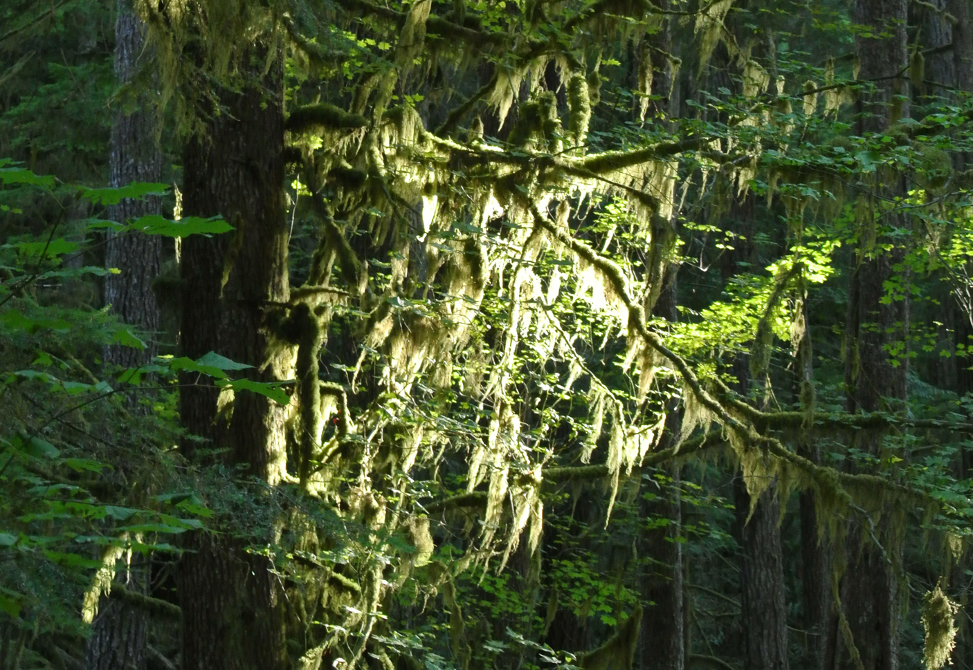
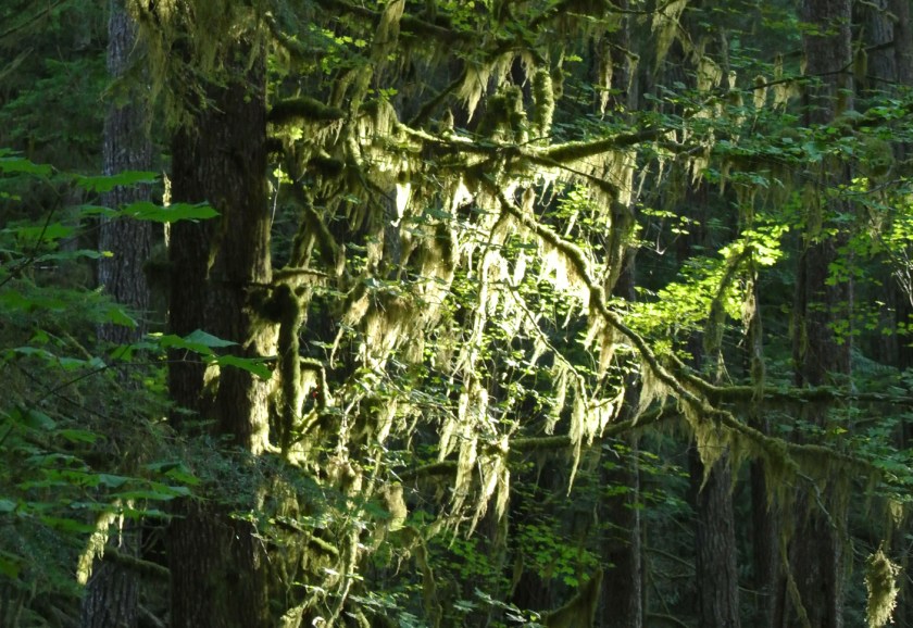
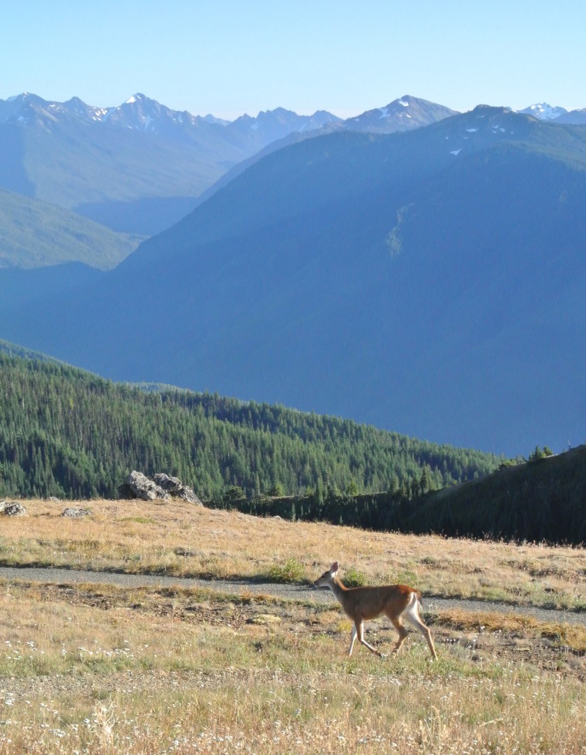
1) A national park with three very different ecosystems, this is one
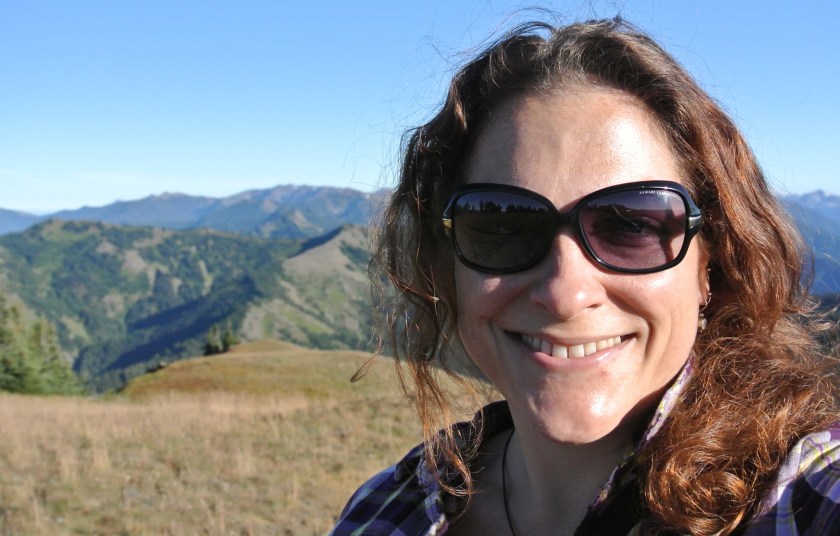
sunlightonmoss


2) me in my element

meinolympic


3) the element I am in, and the second ecosystem

ontopofolympic


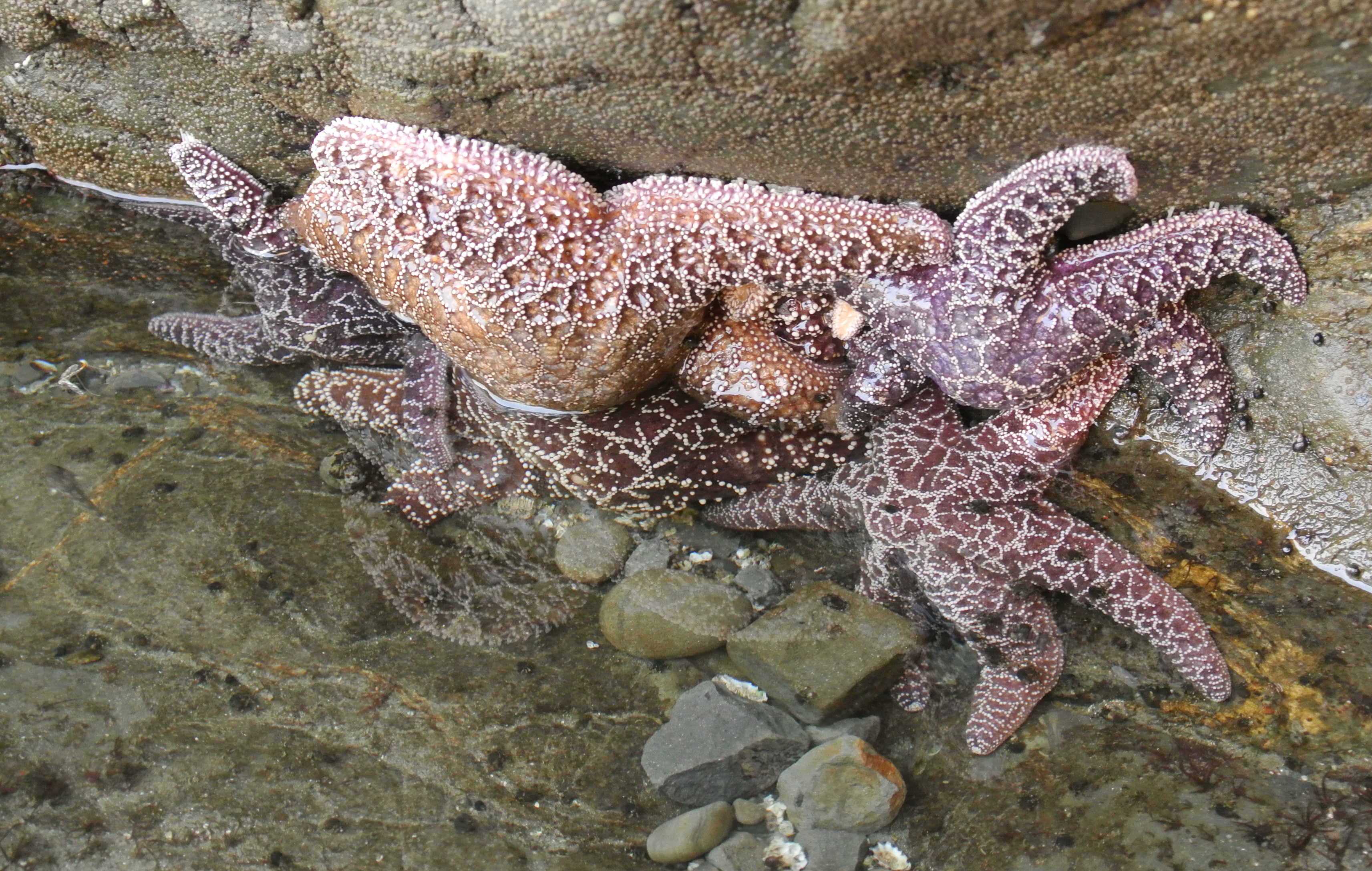
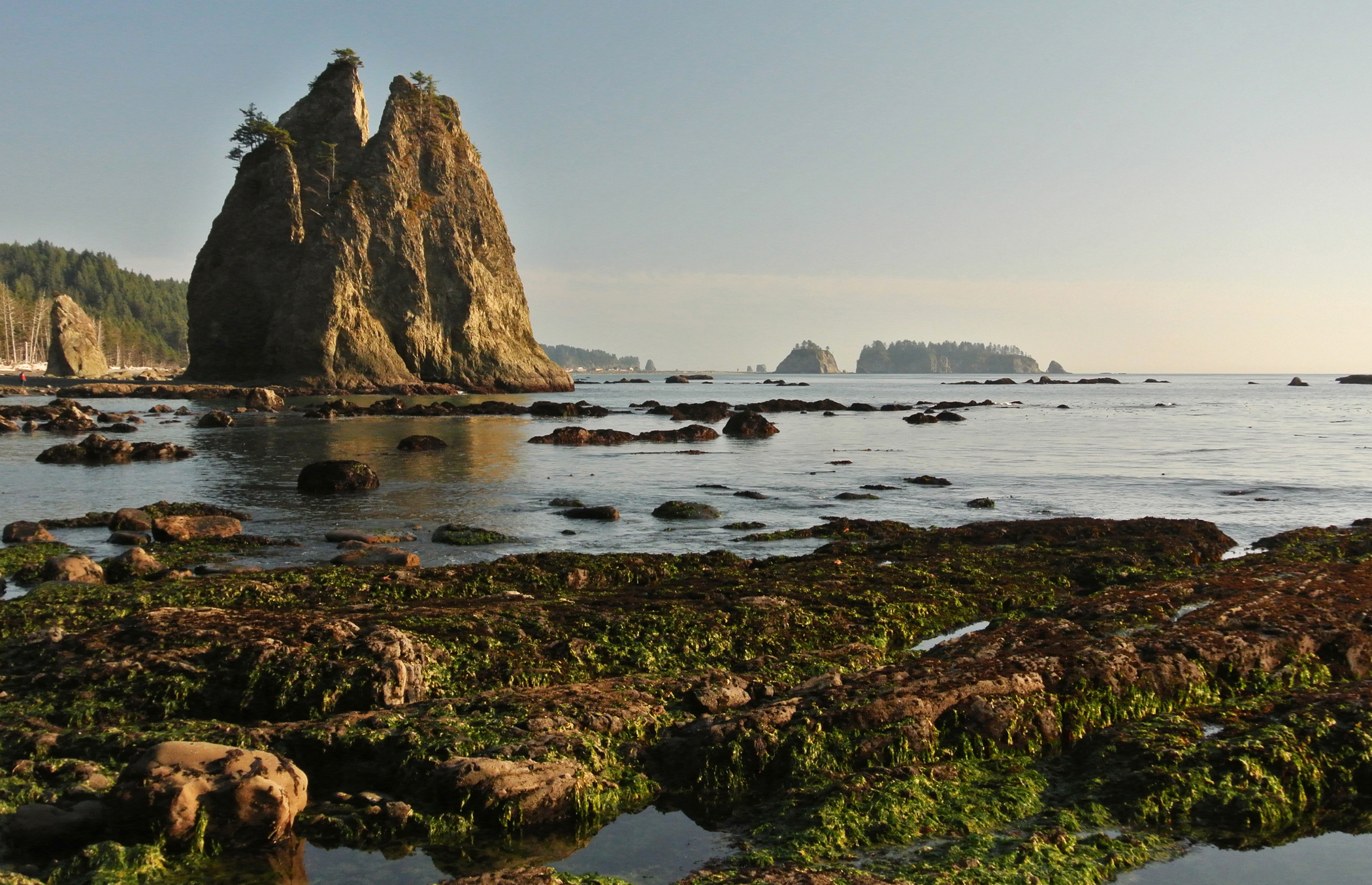
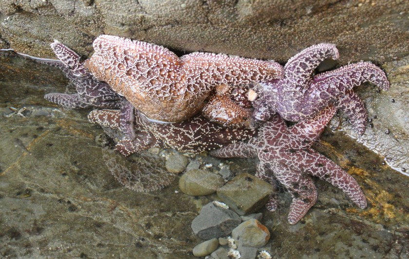
4) tidepools are awesome, that is all.
(If it must be said… the sparkly vampires of pseudo-legend would not be allowed in this tidepool area)

tidepool


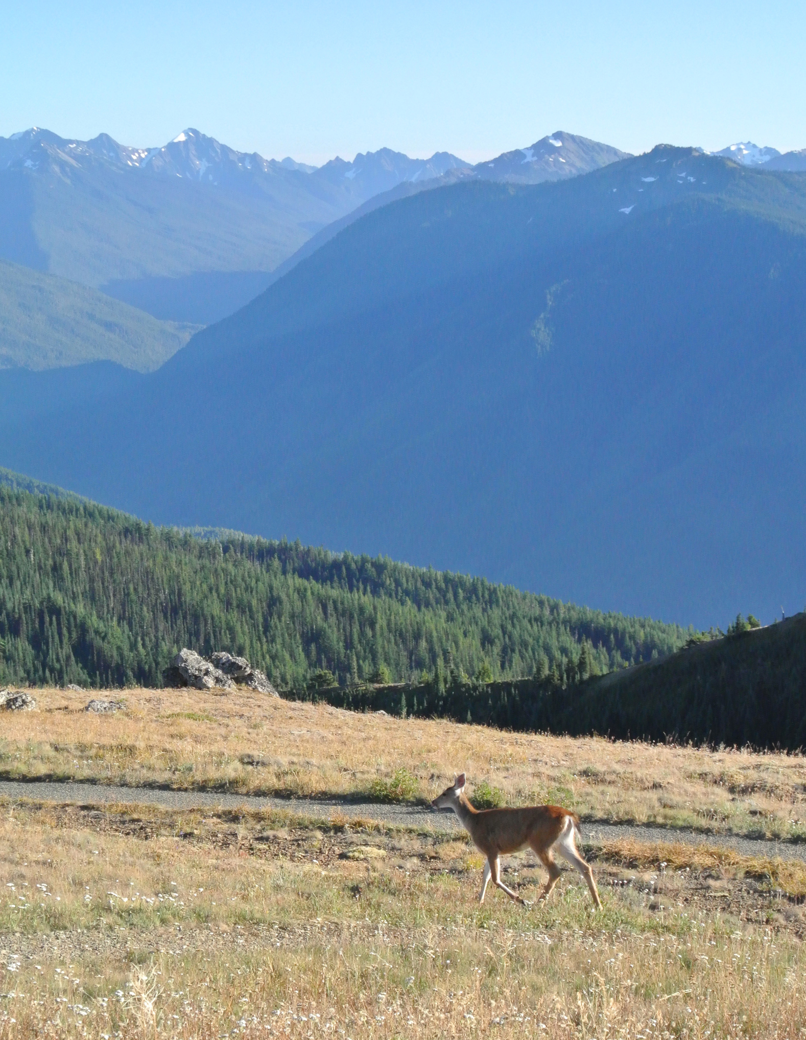
5) third of the three ecosystems

rialtobeach


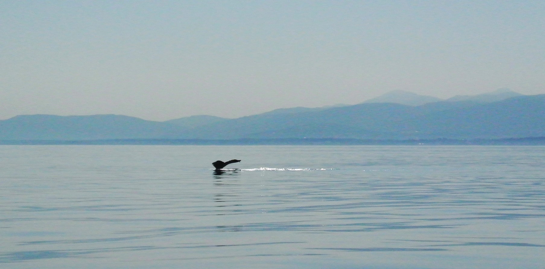
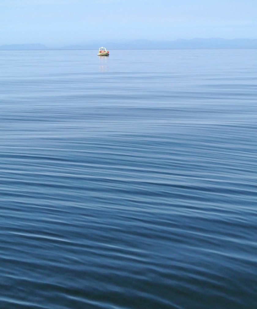
6) Humpback tail! Here in the Sound I learned the continuous shooting function on my camera is very helpful in some circumstances. I also learned that a boat-full of people chanting “tail, tail, tail” is a bit disturbing.

whaletail


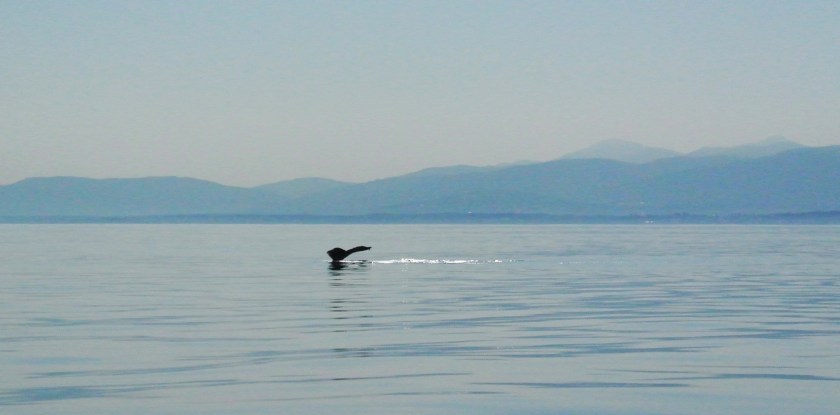
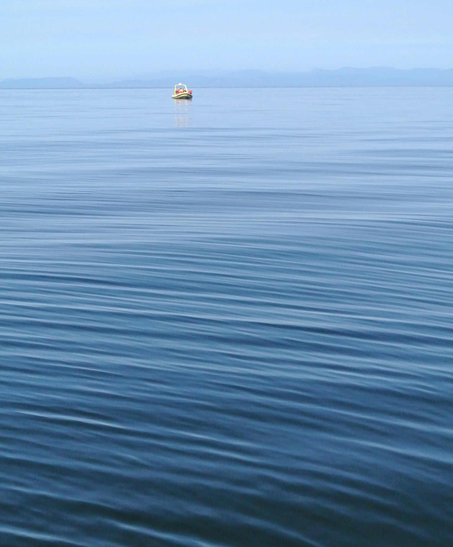
7) not so much a hint as just a thought: I was afraid for this little inflatable whale-watching boat. The whales were MUCH MUCH larger than it.

smallboat


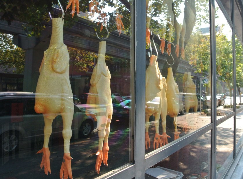
8) humor in Belltown

rubberchickens


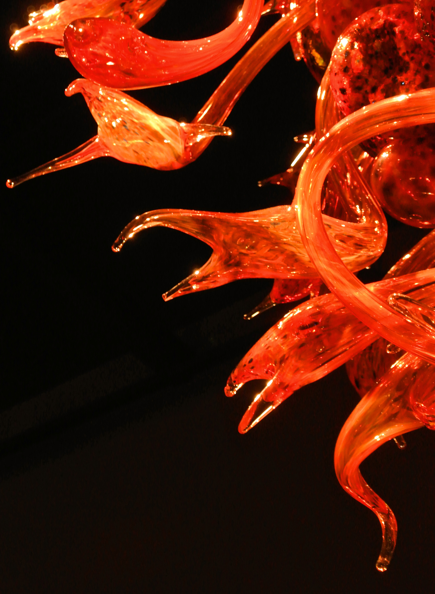
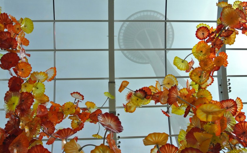
9) how DOES he conform hot glass into such fantastic shapes?

chihuly


10) Second of the three places I can remember tears welling up in my eyes for when seeing in person for the first time. No matter how much of a tourist trap.
(#1 was Busch Stadium in STL in ’93, #3 will be revealed in a later blog post)
(to be fair, anything in Montana does not count in this list)

chihulyspaceneedle


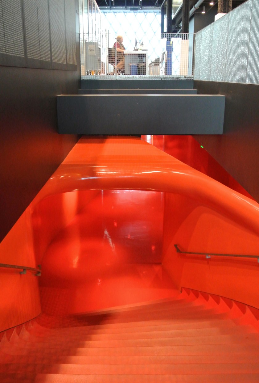
11) one of the only times I’ve been on edge in a public-use space with lots of books. And I liked it.

downtownlibrary


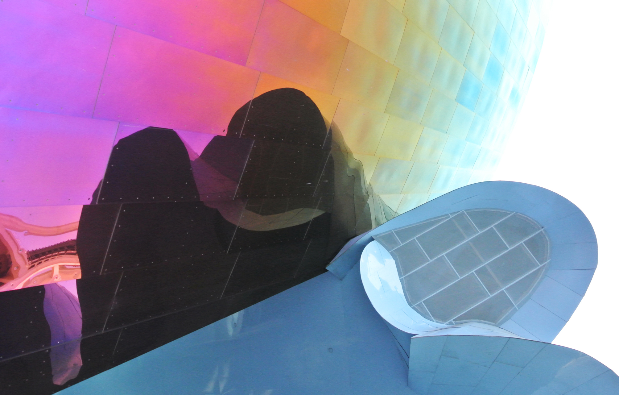
12) Another long-awaited place to visit. I was much more fascinated by the outside than the inside being that I was more of a prog-metal snob than a grunge fan in the early ’90s… thanks for killing that musical movement, certain band whom I will not name.

emp


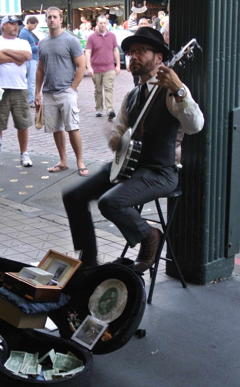
13) A different music genre to alleviate the tension of #12: Banjo at a famous market, down the street from a famous coffee shop where I did not stand in line for coffee.

banjoatthemarket


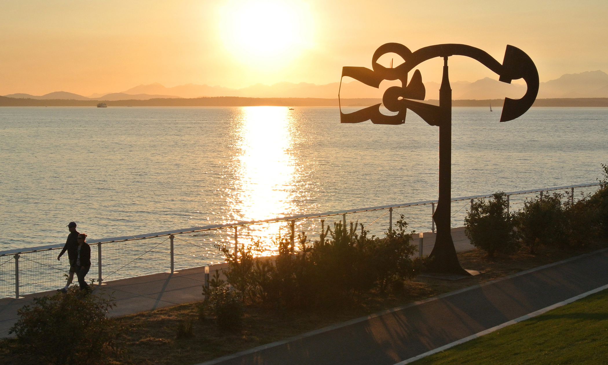
14) public art + sunset + mountains + bay, the components of this city are almost unfair to other cities. Granted, I was there during an incredibly odd & rare stretch of sunny weather.

sunsetonthebay


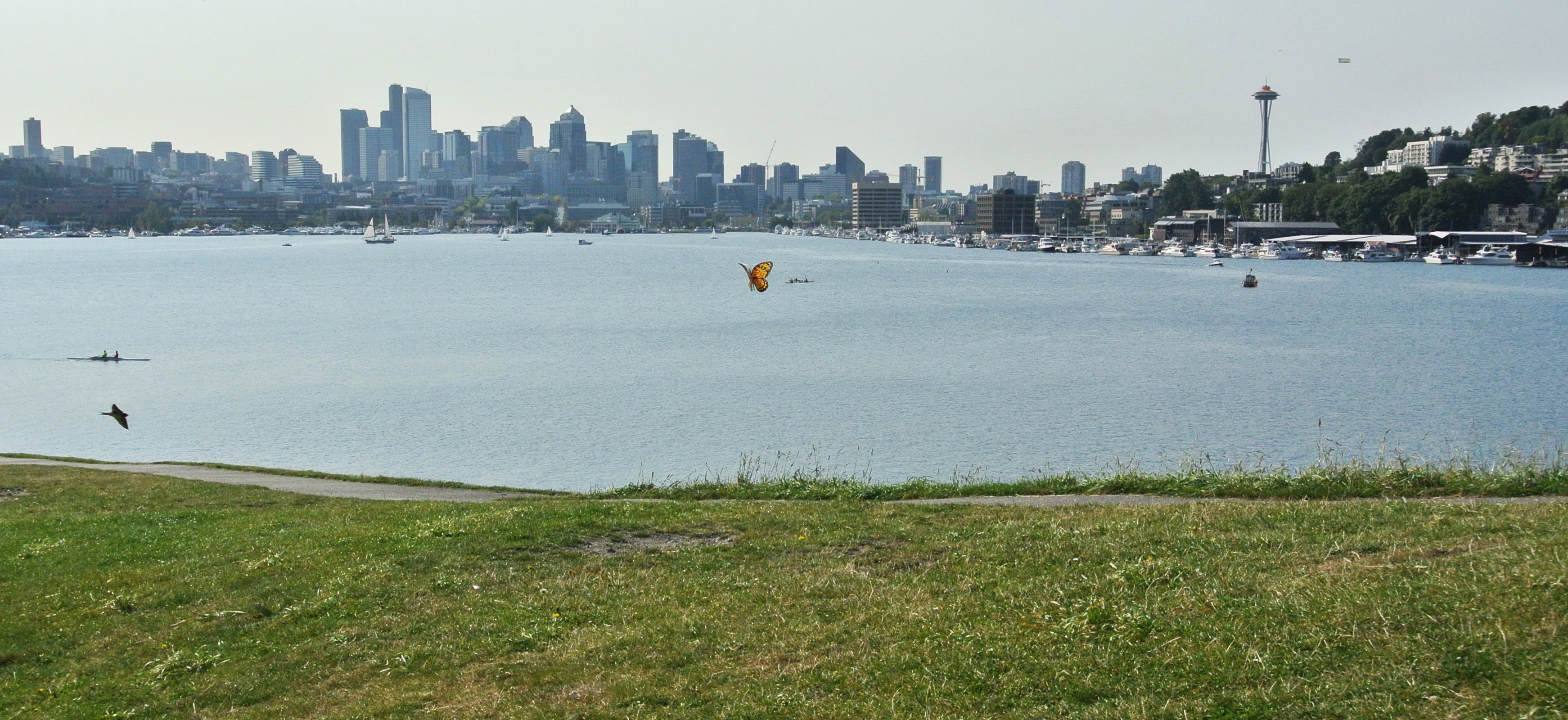
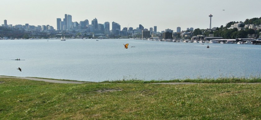
15) ah… (and p.s., the butterfly is actually a kite)

seattle


16) (make your own picture for this caption) the seafood was amazing, and so were Tom Douglas & Co’s tomatoes. Seriously. I visited this area at just the perfect time, it seems. And can’t wait to go back.

old things

graphic design blog, musings

I’ve recently been working my way through the a couple of stacks of books I’ve designed, with the goal of photographing, archiving, and then donating the actual book. The stacks look like this right now, and this is probably 1/6th of the books I’ve worked on over the years:

All of these books become heavier and heavier to move it seems—and as I’ll probably be moving again in early 2013, lessening my book stacks by even a few seems like a grand idea.

There are many memories in these books. Here’s the first series I designed after starting at Lerner:

Fun thing is, I still like how these covers turned out. (The inside is a different story. This was a subset of an existing series of books—I didn’t get to fully redesign the inside. I claim no responsibility for how the inside looks. Or the logo.) This series design with bright, patterned backgrounds and multiple smaller knocked-out photos was really a departure from what the design norm was at the time in the company. I was the young new designer after all, had to make my mark. How long ago this was, I shall not admit.

Now that I look at these again and wax nostalgic, I may not be able to get rid of them after all. Phoo. Plans foiled.

scientific rivalries: creative process

graphic design blog

Ah, the creative process. A process in which research, indecision, dislike, burnout, client decisions, deadlines, breakthroughs, and triumph all are a part. This series cover project had all of that, in spades. Multiple times. It was a trial, but in the end I’m quiet happy with the way these have turned out. These books are a look at scientific discoveries & ideas and the rivalries between scientists who furthered these ideas. Scientists aren’t always the nicest of people, nor do they always play nicely with others…

from the top of the world

graphic design blog

Here’s something I’ve designed recently—Tales from the Top of the World, a book about climbing Mount Everest, focusing on the experiences of ‘Mr. Everest’ Pete Athans. Reading this book will simultaneously make you:
1. want to Climb Mount Everest
2. never ever ever want to climb Mount Everest
3. have immense respect for those who have attempted and accomplished this feat.

I kept the layout fairly simple to show off the photography, aiming for a high-quality magazine feel. And as every bit of climbing Everest has an element of danger involved, I’ve so used a thin red line motif in various places and ways throughout the book.

rrrgh.

graphic design blog, musings

Hey readers. Just a note to say I WANT to post a designery thing or two I’ve done recently, but I can’t because they’re not live and/or published yet. Soon, my pretties, soon.

But for now, a photograph for thinking minds:


Name that artist.

HINT: I did my Contemporary Art History final paper on this artist.
Good hint, I know.

road trips and photography

musings, travel blog & musings

Remember back when I said I had a new camera and was still learning how to use it? Well, I’m still learning of course (when do you ever stop learning) but I do have a better grasp on how to work things now. A recent road trip was a great opportunity to try out some things I’d learned in a recent camera class. Here are some pictures that happened along the way.

Guess where I went.

(By the way, if anyone wants to buy me a birthday present, either this or this would work just fine!)

identity redux one

graphic design blog

And…here it is, new personal identity pieces. I’m much happier with the redo than with the original.


(There’s an invoice design too, just not shown here. That would have been too much white in the display. But, since this is an identity package, you can get a good idea of what it looks like based on the other pieces. Funny how that works.)