it’s an app!

graphic design blog

I’m excited to say my first iPad app is up and running!

It’s been a process. Or several processes, actually. The Adobe process, the Lerner process, and the Apple Developer process. Guess which one took the longest…

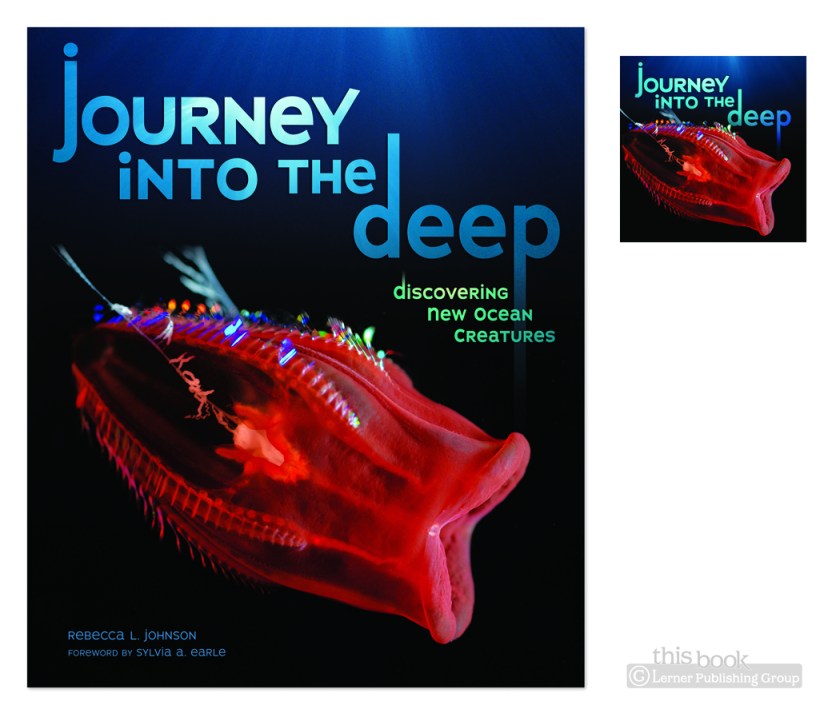
Journey into the Deep (the book) was released in the Fall, and was a joy to work on then. That’s good, since I basically re-did it for app purposes. There are so many fantastical-awesome-alien-looking sea critters in here, I never got tired of the images. As a print piece, they looked nice. Put them on a backlit screen, they look even better.

Here’s my favorite little critter in the book. Check out the eyes:
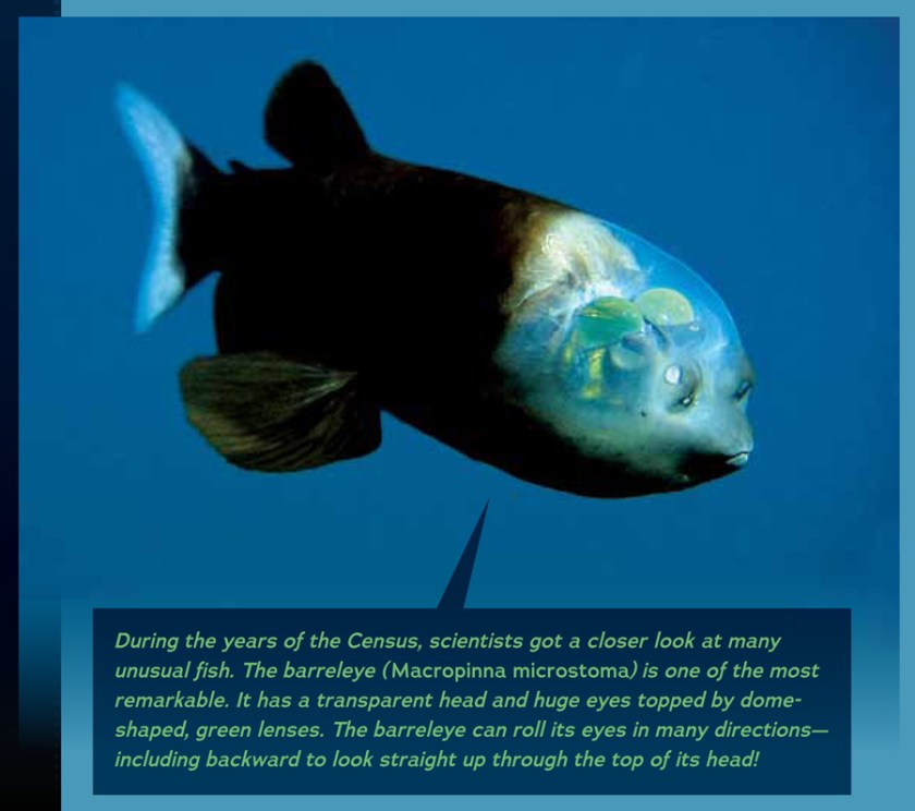
Making an app from a print book was an interesting thing—elements that work in books don’t necessarily add anything to an app. For instance, page numbers! I detailed some more about the app process in a post over on the Lerner Books blog.


Shameless plug: You can buy your own copy of the app here.

standing the test of time, mostly

graphic design blog

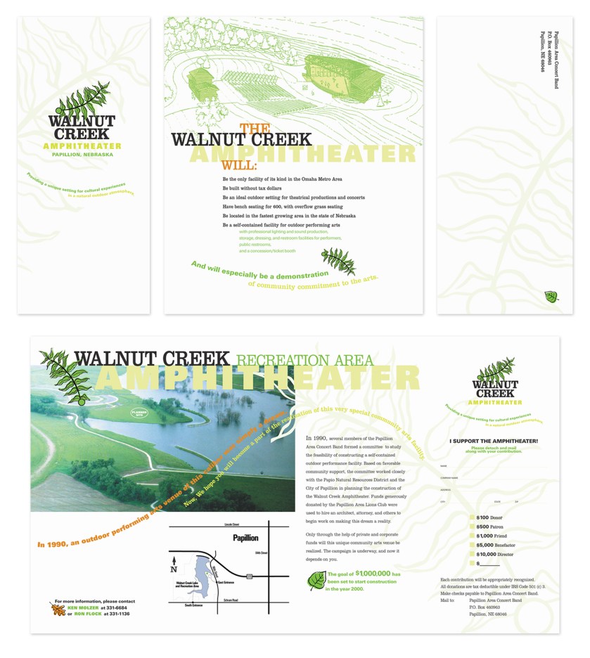
This is OLD. I still like it though. Are there things that could have been done better? Sure! But as a whole the look and feel fit the topic and it still makes me want to listen to music outdoors in my community, so it’s a success. I do like to remember this how it should have been—on a heavier uncoated paper that would give it more of a natural feel—than on the paper the printer used; a glossy lightweight stock. They donated the paper and printing though, so it’s hard to complain too much!

new imprint, new logo

graphic design blog

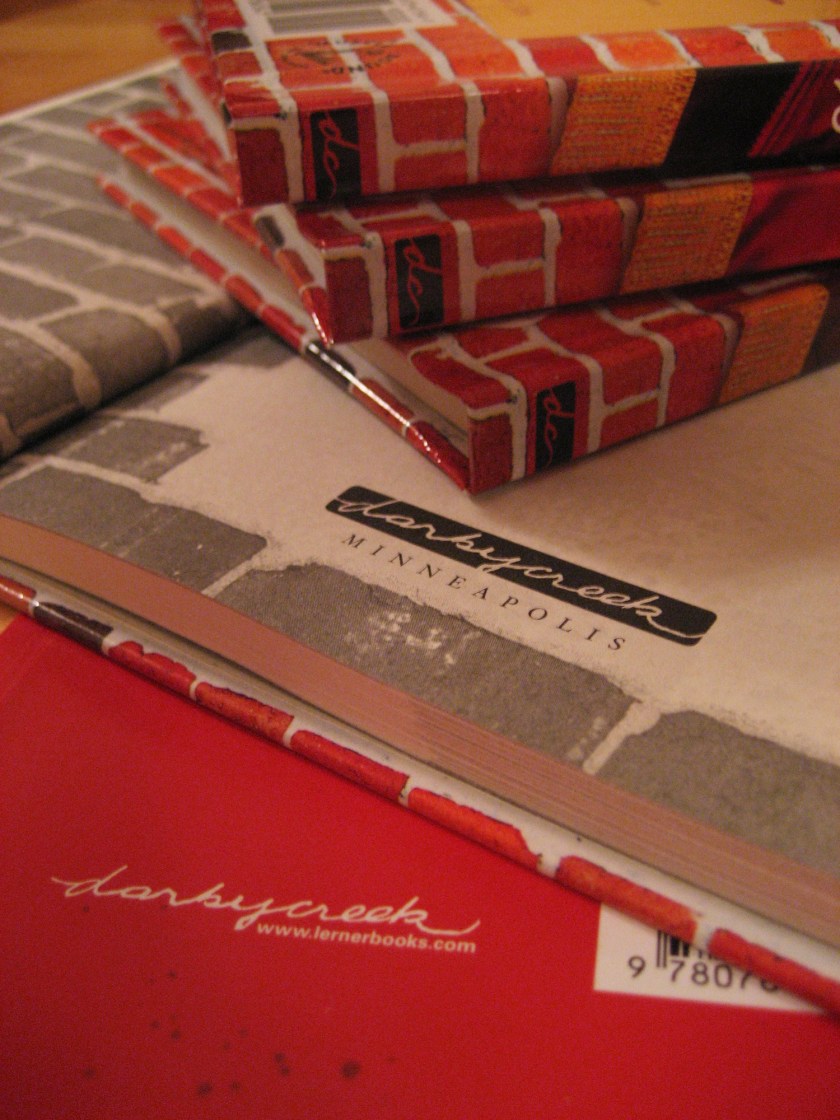
A new logo for an older publisher acquired by my publishing employer as a new imprint. The Darby Creek imprint is comprised of chapter books and YA easy to read fiction.

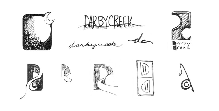
First, sketches, narrowed down some and scanned from my sketchbook:

I seem to remember being really excited about the electrical outlet version at this point, but the reason why escapes me. Reading is that spark of electricity to get the mind going, maybe?

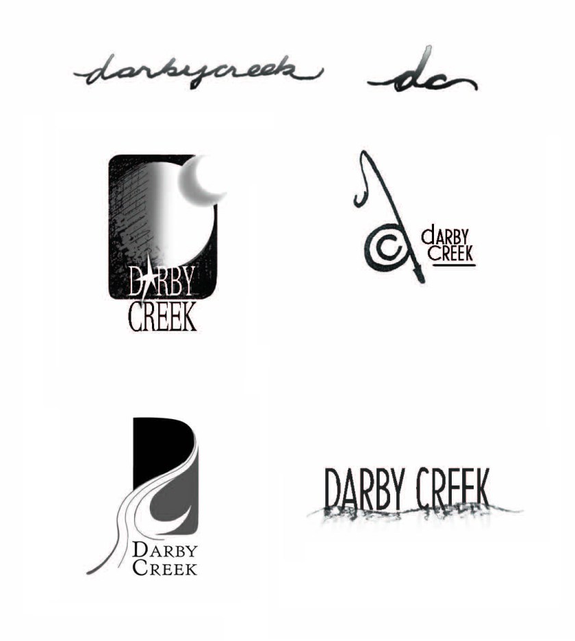
Then I narrowed down the sketches, cleaned up a bit, and sent to all involved parties for input:

Favorites at this point were the fishing pole and the top script. More discussions followed, resulting in the winner:

Cover logo, spine logo, and title page logo are done. And it comes in white, too!

Here it is in use:

it’s always nice to work with beautiful photographs

graphic design blog

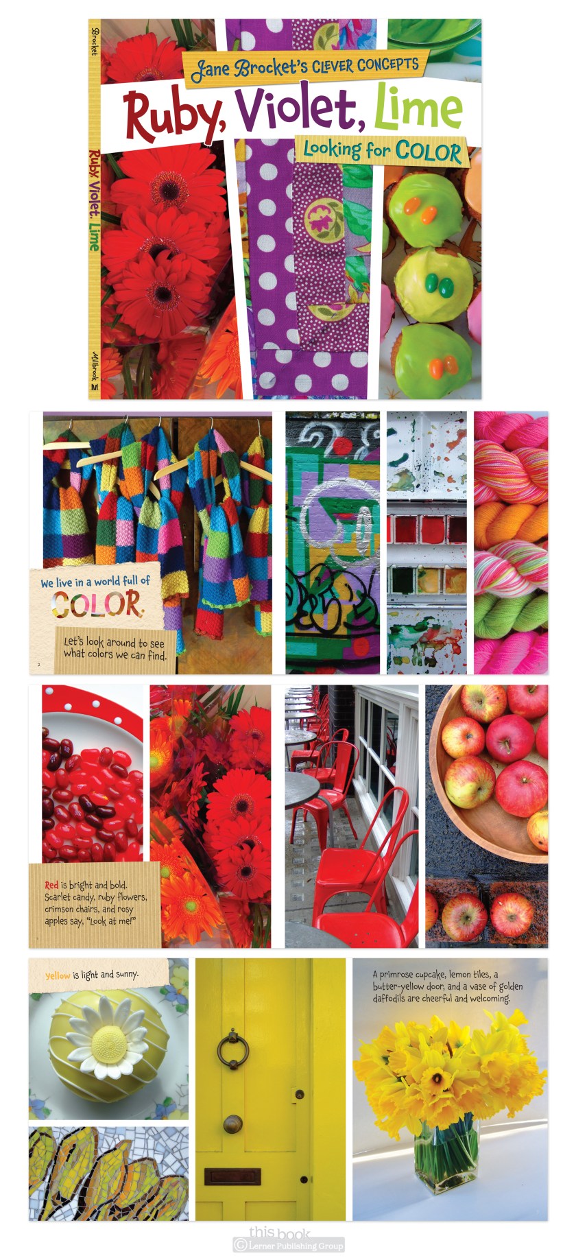
I hadn’t seen Jane Brocket’s photographs or books or followed her blog before I started working on this project. Carol, the delightful editorial director of one of our imprints, had admired Jane’s work for a while so pitched a children’s book project to her. The result was Jane Brocket’s Clever Concepts. Concepts, because this type of book—very young aged, about things such as shapes, colors, etc- are called concept books in the industry.

There are a LOT of these types of books out there. But Jane’s stand out because of the photography. She only uses natural light and photographs everyday things, so her photos have a very soft, familiar, comfortable feel that lends well to books for young children. They’re not your typical children book photos or bright rubber balls and plastic yellow duckies, but I would argue these are better. More room for thought, imagination, discovery. And, you can always live nutritionally vicariously through her photographs of delightful baked goodies.

The design process for these books started with very simple type and photos only, balanced pages and even ratios—my initial reaction to what the layouts needed to be. Then went to more overlapping, tilted, paper bits added, ‘fun’. And then it went back to the original. Almost. Some paper bits were left in, I don’t mind them. In the first book of this series, Textures, the paper only adds to the theme. And in following books (like Colors, shown below) the paper bits help to make type placement more flexible.

frozen design

graphic design blog

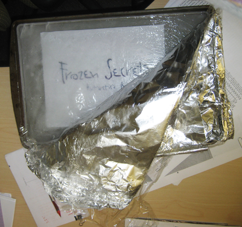
For this book about Antarctica, I wanted to freeze the title in a chunk of ice, photograph it, and use that for the cover. Here’s a part of that process:

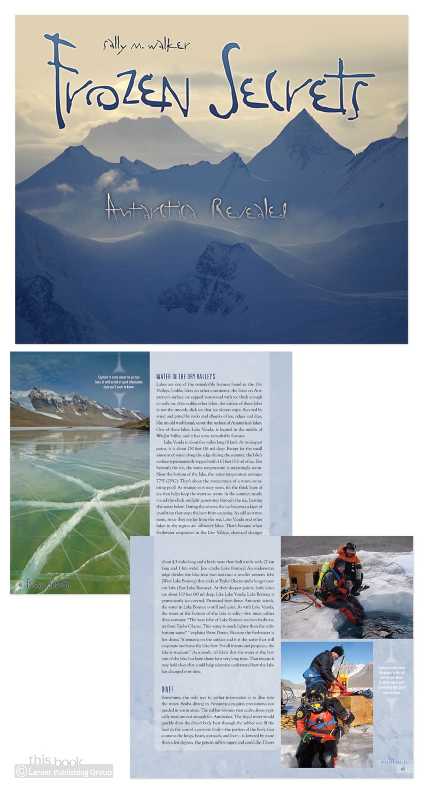
As it turns out, I have yet to learn the fine art of freezing words on paper in a chunk of ice and still making them legible enough for a children’s book cover (without using the Helvetica Neue Black which would have gotten the ‘too institutional’ comment during cover meetings). The cover version using this chunk of ice was not approved, but the the type choice was. Here’s the final cover and a spread:

There’s still ice coverage on every page, but the stock photo variety of ice—not ice from my freezer ice.

not a book!

graphic design blog

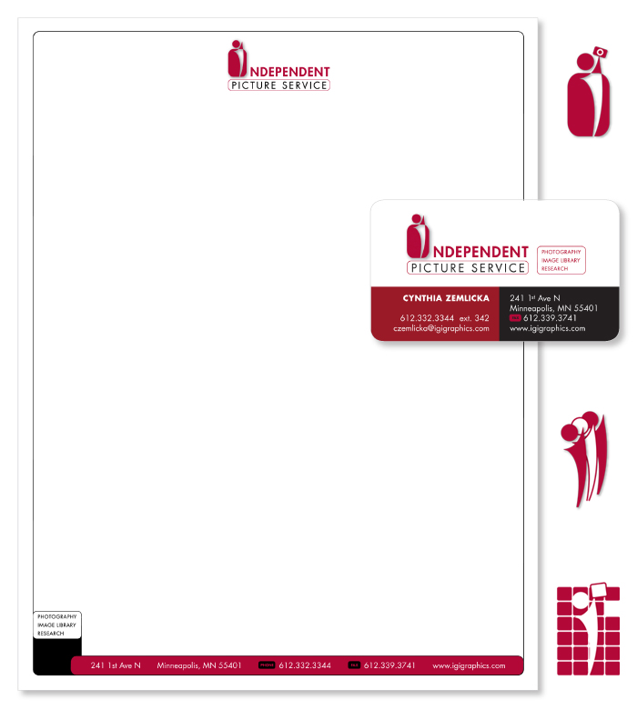
I work for a children’s book publisher, and therefor design a lot of books. This is good, but means it’s also really nice when something else comes along in the workflow that lets me step outside of bookdesignland for a while. Here’s one of those projects: logo, letterhead, and business cards for Independent Picture Service, our in-house photo agency. The three different icons are to use for the three services IPS provides- custom photography, stock photos, and photo research.

a book cover

graphic design blog

Here is a book cover for a junior high to early high school level biography on Martin Luther King Jr. Not sure you could tell who the book was about based on the cover image and the title. This can be the way book cover design in the children’s market goes… obvious imagery and titling, but with interesting treatment of. I did this cover quite a few years ago- it remains one of my favorites.

fewer insects and arachnids: two reasons I moved further north

graphic design blog

This is not completely true—they’re just smaller up here, not fewer. Even if I wasn’t getting away from them, they would at least be harder to see, right? Then along came the Insect World series to design. And so, here I am learning more about them and looking at super-enlarged images of the insects and arachnids I live with everyday. GREAT. Ever seen a micrograph of an eyelash mite?

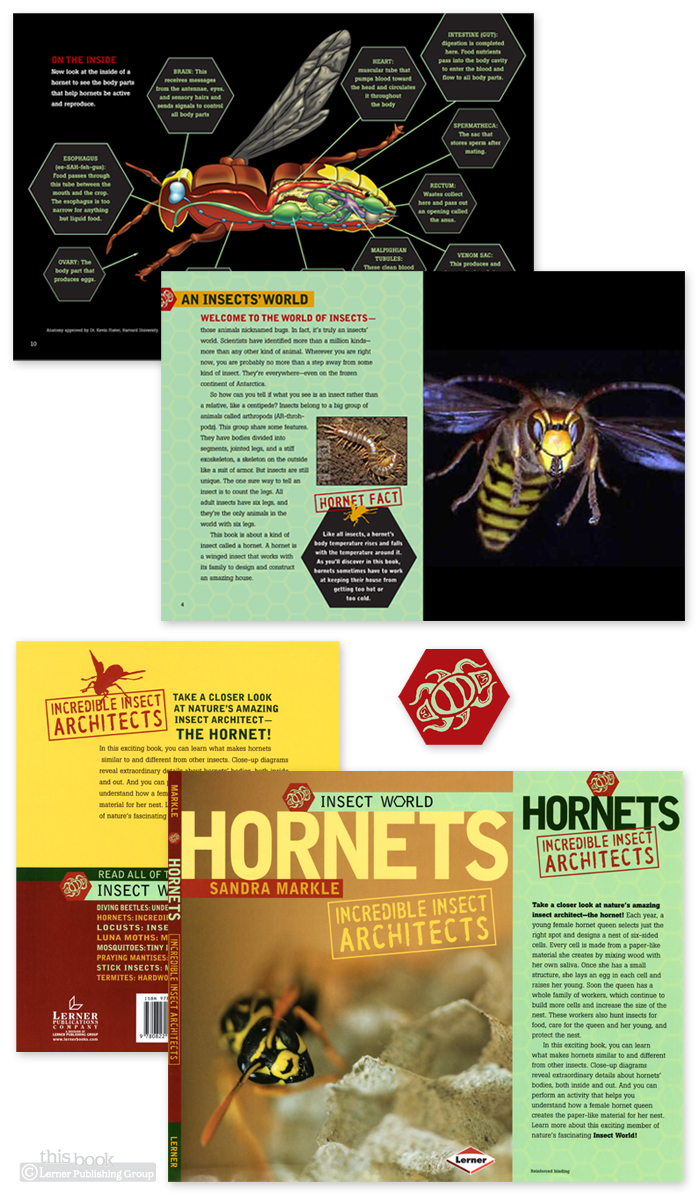
Here’s the Insect World series. There are seven of these books, for a fourth/fifth-grade market. Good for adults, too, if you like to read about the life cycles of insects at an elementary level. Sandra Markle writes a lot of books for us, and luckily I get to design most of them. Sandra’s books are always interesting projects to work on.

I did the logo first for this design, then went on to the rest. The hexagon throughout is to represent the insects, not the hive in this one book. Six legs, six sides….

This series did well in the market, so we did a spin-off series: Arachnid World. I sent those six books to my mom in Southern Illinois so she could read about the arachnids in her backyard at an elementary level. They’re that informative, really. And easy to read. Arachnid World Looks much the same as Insect World with certain details changed. The color, the logo hieroglyph, and the hexagon. That turned into an octagon. Eight legs, eight sides…